블로그 이미지

카테고리

데꾸벅 (194)
Publisher (39)
Scripter (97)
Programmer (1)
Designer (30)
UX (18)
FLASH & FLEX (3)
Photoshop (9)
Integrator (18)
Pattern Searcher (4)
News (2)
강좌 및 번역 (3)

최근에 올라온 글

최근에 달린 댓글


미래를 예측한다는 것은 상당히 힘든일이다.
이 분야 일을 시작한지 어언 십수년이 지나가지만 자신만의 스타일을 고수하기 보다는 매년 트렌드를 따라 작업하다 보니 이런 것을 챙기지 않으면 트렌드를 따라가지 못한다는 강박관념(?)이 생겨버렸다.  트렌드를 쫓다보면 트렌드를 따라가지 못한다는 느낌이 많이 든다. 
각설하고.... 일년전 이맘때 2009년 유행할 웹디자인 트렌드를 포스팅한 적이 있었다. 물론 웹디자인 카테고리에서 가장 많은 트래픽을 가져온 포스팅이기도 했다.
이미 2010년 웹디자인 트렌드에 대해   카페글에 포스팅되어 있는 내용들을 사부작 꼬불쳐 본다.

아래 내용은 2010년 웹디자인 트렌드라는 제목으로 14가지 항목으로 정리되어 있다.

번역본에 데꾸벅만의 생각들을 살포시 얹어보았다 


대부분 2009년 웹디자인 트렌드에서 이미 언급되었거나 국내 환경에서는 유행이 지난 내용들이 많으며 오히려 2008년 트렌드와도 흡사하다. 이제는 해외 사이트트렌드와 국내웹사이트들의 트렌드가 이제는 조금씩 바라보는 뷰가 틀려지기 시작하는 듯 싶다. 

2009년의 트렌드와 비교하자면 조금 객관적이지 못해 작성자만의 지극히 주관적인 생각이며 잘못 설정된 표본집단 조사, 즉 넓은 시각이 아닌 좁은 시각에서 웹디자인 트렌드를 바라본 것 같다. 


데꾸벅이 가장 좋아하는 스티브잡스형님이 이런 얘길 한적이 있다. 


"Design is not just what it looks like and feels like.  

  Design is how it works"


단지 데꾸벅's 생각일뿐~ 오해하지 말자


오래되고 닳은 웹 디자인은 정리를 할 시간이고, 내일을 위한 과감하고 새로운 얼굴들을 맞이할 시간이다.  물론 트렌드라는 것이 1월 1일에 시작이 되고 끝나는것은 아니지만, 새해에는 새로운것을 갈망을 하고, 연말에는 지난간 한해에 교본(tutorial)을 찾게되는 욕구에는 분명 뚜려한 움직임이 있다.  대부분의 경우, 이러한 변화는 미묘하다.  이러한 변화는 현재 트렌드를 완벽하게 만들거나 새롭게 해석을 하는 것이다.  트랜드들은 우리가 디자이너로서 진화를 하는데 도움을 준다.  미적 디자인 스킬을 습득하게 됨에 따라, 우리는 다음에 무엇이 있는지, 우리가 원하는 것이 무엇인지를 추구하게 된다.


이러한 트랜드 뒤에 있는 아이디어들은 당신이 이미 알고 있는 것들도 있음에 오해를 하지 말기바란다.  아래의 트렌드들이 2009년에 인기가 있었던 것들로부터 굉장한 차이가 있는 것은 아니지만, 앞으로 펼쳐지는 트렌드들이 전개가 되고 또한 좋은 결과들로 남게 될 것이다.  당신들이 이러한 트렌드들을 당신의 디자인에 어떻게 이용을 할 것인가를 고민을 할때, 각 트렌드의 주요 아이디어가 무엇인가에 초점을 맞추기를 바란다.


1. 대형로고와 헤더

데꾸벅 : 최근 3년동안의 트렌드와 같은 내용이다.  대형 타이포를 이용하여 사용자시선을 유도한다. 다만 디자인적인 면이 다분이 많으며 사용성에는 그다지 중점을 두지 않은 듯 보인다.

사이트의 스플래쉬 페이지는 너무도 낡은 기법이다.  방문자들에게 잊혀지지 않는 느낌을 주기 위한 2010년의 트랜드는 특대형의 로고와 그와 걸맞는 특대형의 헤더이다.  이러한 류의 헤더는 전체 스크린을 차지하되, 하나의 중용한 메세지를 가지고 있다.  방문자는 아무것도 클릭을 할 필요가 없고, 그냥 스크롤 다운을 하면 된다.  방문자들은 (과거의 나쁜 네비게이션 경험으로 생긴) 종종 마우스클릭에 대한 공포를 가지고 있다. 그래서, 대형 헤더는 당신 사이트의 방문자들 이 무엇인가를 클릭하도록 강요하지 않으면서, 스플래쉬 페이지의 역할을 수행한다.


주요 아이디어: 커다란 헤더는 방문자들이 당신을 기억하게 만든다. 

http://ma.tt/


2. 스케치/손그림

데꾸벅 : 이미 국내에서는 몇년전 부터 웹디자인 템플릿 사이트에 유행이 지난 것으로 주요 프로모션 성격의 사이트에서 많이 사용되고 있다. 

손으로 그린 디자인은 새로운 것은 아니다. 하지만, 웹 디자인에서는 아직은 가장자리를 차지하고 있음을 알고 있다.  많은 디자이너들이 이러한 스타일에 감탄을 하면서도, "나는 잘 그리지 못해"라는 투의 태도때문에 이 스타일을 사용하기를 두려워하고 있다.  이러한 스타일의 디자인들은 미술박물관에 걸만한것은 아니라고 해도, 일탈의 감성적인 면을 전달을 할 수 있고, 차거운 웹 사이트와 친근한 인터랙션의 경계를 흐리게 할 수 있다 - 그게 인터넷의 궁극적 목적이 아니겠는가?  만약 그림을 끄적거릴 수 있다면, 당신은 이미 웹 디자인을 스케치 할 수 있다.


2010년에는 스케치는 웹 디자인상의 요소로 자리를 할 것이고, 웹 디자인의 주 초점이 되지는 않을 것이다.  또한 스케치는 표준적인 웹을 새롭고 흥미있는 것으로 개인화 시키는 데 사용이 될 것이다.


주요 아이디어: 스케치는 기업 웹 사이트 디자인의 "요소"가 될 것이다.

 
http://www.biola.edu/undergrad/


3. 굵고 두꺼운(Slab) 글꼴


데꾸벅 : 최근3년 트렌드에서도 언급되었던 내용이다.  전통적인 인쇄매체에서 많이 사용되던 Press Letter형태를 웹형태로 옮겨온 것으로 영문폰트를 이용하여  적용한 예가 많다. 한글폰트에서도 두꺼운 글꼴은 글쎄다~. 

 폭이 넓은 글자체는 지난 200년 동안 전통적인 미디어에서는 사용이 되어왔지만, 웹 디자인에서는 비교적 새로운 것이다.  폭넓은 글자체의 좋은 "감"을 얻으려면, 옛날 옛날 서부 개척시대의 "현상금" 포스터를 생각을 하면 될 것이다.  이때 사용이 된 굵은 글자체들이 "Slab" 타이프이다.  폭이 넓은 글자체들은 보통 모두 대문자에, 볼드로 처리가 되어있고, 그리고 눈을 끌어당기는 당당하게 보인다.  많은 디자이너들이 과거에는 슬랩 타이프를 멀리 해왔는데, 슬랩 타이프가 사용이 되면 로고나 헤더들이 저평가 되게 보일 수 있기 때문이다.  하지만, 대형 헤더라는 트렌드와 같이 사용이 되면, 슬랩 타이프를 사용할 때 독자들의 시선을 끌수가 있다.


주요 아이디어: 슬랩 타이프는 당신 누구인지 과감하게 표현하기 위해 사용이 된다.


http://www.edgepointchurch.com/


4. 타이포

데꾸벅 : 타이포그라피와 관련된 내용은 당근 이전부터 쭈욱~ 언급되었던 내용이다. 굳이 무엇을 더 언급할것인가 

타이포그라피는 적용하기에 가장 어려운 트렌드 중에 하나이기때문에, 2010년에도 싱싱하게 존재를 할 것이다.  사용성관련된 모든 걱정들 때문에, 웹 디자이너들은 새롭고 색다른 폰트를 사용하기를 꺼려한다.  다른 폰트사이즈들을 섞는 다는 생각은 절대로 할 수도 없는 것이 였다. 하지만, 폰트들은 탐구의 대상이고, 비틀고, 우리의 목적에 적합하도록 사용이 되어야 한다.  정확한 위치선정을 한다면, 타이포그라피를 주요 디자인 요로 사용을 하는 웹 사이트들은 수많은 사진들로 부담이 되는 사이트들 보다는 독자들에게 더 흥미로와 보일 것이다.


주요 아이디어: 타이포그라피의 사용은 아직 충분한 성장을 하지 못했지만, 웹 디자인의 한 부분으로 남아있을 것이다.


5. 한 페이지 레이아웃

데꾸벅 : 이미 Interaction한 Rich UI Layout ( Web Application 혹은 Ajax Application) 이 자리잡은 요즘에 비하면 2010년 트렌드라 말하기에는 조금 오래된 내용이다. 

한 페이지 레이아웃은 필요하지 않는 부분을 제거를 하게끔 하는 과제를 준다.  2010년에는 이 스타일이 특이한 네비게이션을 버리고 미니멀리즘 접근방식을 택할 것이다.  이러한 웹 사이트들을 비즈니스 카드라고 생각을 하라.  이러한 웹 사이트들은 당신과 다양한 사이트들에 퍼져있는 당신의 작업물들을 어떻게 찾을까를 알려주는 one-stop-shop이 될 것이다.


주요 아이디어: 한 페이지 레이아웃은 기업 사이트가 보다는 개인 프로파일에 더 적합하다.


 http://www.zachklein.com/


6. 큰이미지

데꾸벅 : 큰 이미지뿐만 아니라 이제는 화면전체를 이미지로 깔고 덮고 플래쉬로 도배를 하기도 한다. 

대형 로고/헤더와 가까운 친척인 대형 이미지는 거의 같은 기능을 제공한다.  대형 이미지들은 방문자들이 쉽게 잊지 못할 효과를 준다.  위에서 이야기를 한 대형 헤더와는 달리, 대형 이미지는 사이트의 브랜딩과 관련이 있는 것은 아니다.  대신에, 이러한 이미지들은 방문자들을 사이트의 컨텐츠가 아니라면 이미지를 이용해서라도 방문자들을 사이트로 끌어들인다. 2010년에는, 웹 디자이너들은 사이트의 느낌을 전달하기 위해서, 대형 이미지를 사용하는 것을 더욱 편안하게 느낄것이다. 


주요 아이디어: 대형 이미지들은 방문자들을 초대하기 위해서 사용이 된다.


http://digitalmash.com/ 


7. 시각의 변화

데꾸벅: 좀 더 비주얼한 면을 강조하기 위해 2D에서 3D형태 뷰포인트의 전환등 이러한 시도는 항상 있어왔다. Flex/Flash, 혹은 Silverlight,  SVG, VML 등 이미 수없이 많은 디자인 사이트에서 봐왔던 내용이다. 

이미 위에서 이야기를 한것과 같이, 데스크 탑 형태의 디자인은 지겹도록 사용이 되어왔다. 2010년에는  좀더 현실감있는 시각으로 변화가 될 것이다. 공간에서 옆을 보는 것과 같은 시각으로 이동도 있을 수 있다.


주요 아이디어: 2010년 여러가지 다른 시각/시점이 시도가 될 것이다.


http://downsign.deviantart.com/art/Book-Store-136542851


http://kpucu.deviantart.com/art/Pastorant-Restaurant-71565329


8.인터렉티브/직관적 디자인

데꾸벅 : 웹디자인이나 UI/UX에 대한 입문서에 나올만한 내용이다. 인터렉티브하고 직관적인것인 이미 디폴트인 시대에 살고 있다.

Flash는 지금보다는 더 인기가 있었던 적이 있었다.  한때는 짜증스러운 Flash 인터페이스가 없는 사이트들을 피할 수 없었던 적도 있었다.  최근에는, Flash는 좀더 편안하고 좀더 전문스러워 졌다.  어떤 디자이너들은 폼이나 팝업을 위해서 jQuery를 더 선호할 수도 있지만, Flash는 적당하게 사용이 되었을때면 아직도 웹 디자인의 중요한 부분이다.  Flash은 인터랙티브한 면에서는 아직도 적수가 없다.  2010년에는 웹 디자인너들은 Flash를 좀더 보완할 수 있는 요소들로 이동을 할 것이다.  최근의 방문자들은 웹에 대해서 대부분 잘 알고 있기 때문에, 디자이너들은 과거의 사이트들 보다는 좀더 직관적인 사이트를 제작을 할 것이다.


주요 아이디어: 인터랙티브 디자인이 컴백을 할 것이다.


 http://www.crowleywebb.com/


9. 모달창

데꾸벅 : 최근 3년동안의 웹트렌드에서도 언급되었던 내용이며 2010년에도 계속 유행될듯 싶다. 워낙 막강한 javascript library나 Framework들과 RICH Tool들이 많다 보니 이제는 구현하기도 쉬워졌다.

모달 윈도우는 2010년에는 말 그대로 사방에서 볼 수 있는 트랜드가 될 것이다.  모달 윈도우는 팝업하고는 달리 부드럽고, 모양도 좋고 더 인기가 많다. 모달 윈도우는 디자인과 사용이 너무 쉽게 때문에, 사용성을 염두에 두는 디자이너들에게는 최적의 해법이 될 것이다.


주요 아이디어: 모달윈도우는 2010년에도 지속적으로 사용이 될 것이다.


 http://digg.com/


10. 미니멀리즘


데꾸벅 : 모노톤이나 명조대비만으로 여백의 미를 강조하는 동양적인 디자인 컨셉에서 부터 시작된다. 과거 해외사이트를 살펴보면 대부분 여백에 텍스쳐나 바탕이미지를 사용하였으나 이제는 "오리엔탈 이즈 베스트 ~~~"

과거의 미니멀리즘 웹 사이트는 잊어도 좋다.  2010년의 웹 사이들은 많은 여백을 사용을 하되, 과감한 타이포그라피와 놀라운 컬러 스킴을 이용을 할 것이다.  모든 미니멀 웹 사이트들이 명확한 간결성 개념과 일치 하지는 않을 것이다. 미니멀리즘은 그 본연이 강도가 떨어지기는 하지만, 새로운 색상들이 채용이 될 것이다.  미니멀리즘은 차가운 것이 아니고, 따듯하고 핵심을 찌르는 것이다.


주요 아이디어: 미니멀리즘은 타이포그라피로 모험을 시도할 것이다.


 http://www.kylestanding.com/


11. 대형푸터

데꾸벅 : 일전에 데꾸벅의 블로그에서도 한번 포스팅 되었던 내용이기도 하다. 메인기능이 아니라 부가기능이나 정보, 혹은 메타성 데이타를 한곳에 몰아둔다는 느낌이 없지 않아 있다. 국내의 현실은 대부분 숨겼다/보여주는 형태로 많이 구현되고 있다.

대형 푸터는 이미 여기저기에서 볼 수가 있지만, 2010년에는 좀더 과장되게 사용이 될 것이다. 앞으로의 푸터는 미약한 존재가 아닌 디자인의 중요한 부분이 될 것이다.  앞으로는 다양한 소셜미디어 사이트의 부터의 피드, 투표기능, 트위터 피드와 같은 무작위적인 정보를 포함을 하고 있는 푸터도 보게 될 것이다.


주요 아이디어: 대형 푸터는 중요도는 떨어지지만, 좀더 퍼스널한 정보를 제공을 할 것이다.

http://www.duirwaigh.com/


 http://oldloft.com/


12. 복고

복고풍의 디자인은 당분간 남아있을 것이다.  많은 수의 디자이너들이 복고풍의 디자인에 감탄을 하기는 하지만, "마무리"를 제대로 짓지 않는 느낌을 제대로 소화하는 것은 쉽지 않다.  복고풍 디자인의 디자인의 톤과 저변에 깔린 재미요소를 통한 영감을 받아야 한다.  2010년의 레트로 디자인은 구식예술을 존중하는 새로운 방법을 찾아갈 것이다.


주요 아이디어: 복고는 "새롭다"


 http://www.level2d.com/


13.  인트로 상자

데꾸벅 : 2009년 웹디자인트렌트 맨 마지막 아이템으로 소개되었던 내용이다. 2010년에도 계속 쭈욱~ 될 듯 싶다.

2010년 디자이너들은 "안녕, 내이름.. " 하는 식의 자신을 방문자에게 소개하는 아름답기까지한 간결함을 알게될 것이다.  만일 당신이 창의적인 "About" 페이지 구성에 고민을 하고 있다면, 인트로 박스가 아마 최적의 답이 될 것이다.  인트로 박스는 당신이 누구인지를 제한된 면적을 통해 알려야 하기 때문에, 정보를 농축시키도록 강요할 것이다.  2010년의 인트로 박스는 그 사용영역을 단순 소개를 넘어서게 될 것이다.  지루한 "Hello"가 아닌 좀더 새로운 "인사법"을 디자이너들은 찾게 될 것이다.  그리고, 왼쪽에 치우쳐서 놓이는 인트로 박스가 아닌, 특이한 자리에 놓이는 - 예를 들면 페이지의 중간 같은 - 인트로 박스를 보게 될 것이다.


주요 아이디어: "Hello"를 하는 새로운 방법들


http://www.alessandro-cavallo.de/ 


14. 잡지형식의 레이아웃

데꾸벅 : 2009년 웹디자인트렌트 맨 처음 아이템으로 이미 소개되었던 내용이고 웹도 인쇄매체와 마찬가지로 2D라는 측면에서 접근하는 경향이 많다.  대부분의 레이아웃 설계나 정보설계(IA)시 인쇄매체의 레이아웃을 많이 참조하는 경향이 있다. 

사람들이 점점 더 전통적 인쇄물의 편안함에서 온라인으로 이동을 함에 따라, 디자이너들은 그들의 이동을 부드럽게 하는, 새로운 "환영 방법"을 찾고 있다.  한장의 홈페이지에 잘 정돈이 된 정보들을 가진, 잡지포맷의 디자인을 제공하여, 방문자들이 원하는 정보를 찾아보도록 하는, 이동이 생기고 있다.  잡지나 신문을 읽어본 사람이라면, 제공이 되는 익숙한 디자인에 호감을 갖을 것이고, 사용에 편안함을 느낄 것이다.  2010년에는 잡지포맷은 블로그에서 특히 인기가 있을 것이다.


주요 아이디어: 잡지 형태가 인포테인먼트 사이트에서 사용이 될 것이다.


 http://www.bmivoyager.com/


Post by 넥스트리소프트 데꾸벅(techbug)
, |


간만에 포스팅인것 같다!  네트웍이 되지 않은곳에 오래동안 프로젝트를 뛰다 보니 포스팅이 뜸하다!
간만에 맞는 한가한 주말에 포스팅해본다.
----


많은 웹디자이너가 디자인할때 가장 곤혹스러워 하는 부분이 칼라선택이다.
한 사이트의 칼라스키마는 사이트의 전체적인 느낌뿐만아니라 방문자에게도 가장 큰 영향을 줄 수 있는 요소다. 
한 프로젝트에서도 올바른 칼라스키마를 찾는 방법은 수없이 많다. 이번 포스팅에서 여러가지 방법들을 살펴볼것이다. 


고객의 자산에서 칼라 수집하기

이미  고객들은  자신들의 마케팅자료나 웹사이트로부터 자신들만의 칼라스키마를 가지고 있다. 
어떤 경우, 고객들은 자신의 칼라를 바꿔주길 원하나  디자이너 대부분은 기존의 칼라 스키마를 가지고 작업에 활용하기를 원한다.  때때로 기본 칼라의 작은 변화가 영향을 주기도 하며 참신한 웹사이트 디자인을  그들의 회사이미지(identity)를 추가함으로써  작은 변화를 꾀하기도 한다.

만일 자신만의 칼라스키마가 없는 고객들과 함께 일할 경우는 아래 웹사이트를 참조하여 자신만의 올바른 칼라선택법을 가져보는것도 괜찮을듯 싶다.


온라인 칼라팔레트 리소스
아래는 칼라팔렛트를 선택할수 있는 온라인 툴들과 웹사이트들이다.  자신의 칼라 팔레트를 업로드하고 함께 공유하는 사이트는 많이 있다. 

Adobe Kuler


COLOURlovers

ColorSchemer

ColoRotate

Others:


Copaso

Color Scheme Designer

Toucan

ColorMunki

The Color Wizard

Color Explorer


사진으로 부터 칼라축출하기

칼라소스에 가장 큰 영감을 주는것은 사진이다. 

ColorSuckr

Pictaculous

What’s Its Color?

Others:


잡지나 인쇄물에서 칼라 축출하기

온라인소스는 단지 칼라스키마를 찾기위한 곳이 아니다.  잡지나 서적, 포스터, 브로슈어, 카드, 인쇄물 또한 칼라 선택하는 또다른 리소스이다. 


웹디자인갤러리

웹에서 작업하기 가장좋은 칼라스키마를 찾는 방법중의 하나는 디자인갤러리를 통한 방법이다. 물론 좋은것이 특정 프로젝트에서 필요한것이 아닐지라도 종종 몇개의 칼라는 여러분의작업에 많은 아이디어를 제공할것이다.   

 inspired by other sites.

I Like Your Colors  은 URL을 입력하는것만으로 사용된 칼라의 헥사값을 축출해준다.


기본 칼라철학

칼라를 선택할때 고려해야할 한가지 요소가 바로 칼라철학이다. 아래는 칼라철학과 관련된 기사와 온라인 리소스목록이다.


자연에서 칼라축출하기

칼라는 자연에서 어디에서나 존재한다. 한발짝만 떨어져 주위를 돌아보면 여러분은 어디에서는 칼라에 대한 영감을 얻을수 있다. 항상 좋은 눈을 갖기를 원하며...


원본 출처 : VandelayDesign


Post by 넥스트리소프트 데꾸벅(techbug)
, |

요즘은 화면 가득히 큰 사이즈의 백그라운드를 사용한 웹사이트가 점점 증가하는 추세이다.
이전에도 이러한 시도들은 많았으나 속도면에서나 리소스 사용율이 많다는 한계에 부딪혀 작은 이미지를 자바스크립트를 이용해 백그라운드에 넣었던 기억이 난다.
화면 퀄러티도 떨어지지 않고 조화를 이루면서 리소스면에서도 우수한 사이트들을 추천해 본다.
국내의 웹디자이너들도 이러한 추세를 많이 따라가고 있는데 해외사이트와 달리 전체 Full Flash사이트를 많이 접하게 된다. 아무래도 리소스면에서 풀이미지보다 벡터이미지로 처리하려고 그런것 같은데 아래 사이트들의 소스를 분석해 보면서 어떻게 사용하고 있는지 분석해 보는것도 좋을것 같다.

※ 발췌한곳이 해외사이트(VANDELAY DESIGN)이다 보니 국내사이트에 대한 내용이 없는데 추천하고 싶은곳이 있다면 댓글이나 트랙백으로 남겨주세요 ^^


Lanbruk’s Gunyah


Pixel Image


The Circumference


Not Your Average Joe


Montel Media Group


Hellenic Holidays


Housing Works


Gazelle Touch


Bike Friday


JasonDorn.com


Pillsbury


Travis & Presley


TOOBYDOO


eleven3


Text on Color


Ace of Base


MEDIENRING


Farmhouse Fare


Carolina Jesus


WallSwaps


Elite Pre-Vestibular


Roar


August


NOFRKS Design Studio


BH Eurosong


Get London Reading


Longfellow Ranches


Upstruct


ANidea


Global Ventures


Le Nordik


Skate2 + Etnies


Peter Pearson


Creative Spaces


Post by 넥스트리소프트 데꾸벅(techbug)
, |

웹디자인을 하다가 보면 전체적인 틀을 잡고 각각의 요소마다 채워나가다보면 항상 푸터가 고민되는 경우가 있다. 웹사이트 푸터를 모아놓거나 각각의 요소(헤더,좌측 사이드바, 메뉴영역, 푸터)들을 수집(?) 놓는 경우가 많은데 좋은 푸터들을 모아놓은 사이트가 있어서 소개한다.
해당 이미지나 기법들을 그대로 따라 베끼라는 얘기가 아니라 영감(Inspiration)을 얻는데 도움이 되라는 취지에서 포스팅한다.


1. Bcandullo

2. Creamy CSS

3. Brand 07

4. Rich Moris

5. David Hellmann

6. Albertlo

7. VSplash

8. Tulsa Tough

9. Ten Thoushand Things

10. Nuevo Aurich

11. Seraph Design

12. Bio Wind

13. Biola

14. Blog Amuki

15. Blog me Tender

16. Heres Life Africa

17. Forty Seven Media

18. Edege Point Chruch

19. Bristol Archive Records

20. Hutch House

21. Komodo Media

22. Matt

23. Mr Diggles

24. Nortehren Classic

25. Seed huinter

26. Spilt da diz

27. The Brads

28. Bits & Pixels

29. US Trendy

30. Viget


VANDELAY DESIGN에서 추천하는 25개의 인상깊은 블로그푸터(25 Impressive Blog Footers) 들도 들러보길 바란다.


Post by 넥스트리소프트 데꾸벅(techbug)
, |


클라이언트에게 지속적인 관심을 가지게 하거나 알리기 위해 명함을 사용한다.
보통 명함들은 간결하게 만드는 경우가 있는데 간결하다고 평범한것이 아니다(Simplicity doesn’t equal plain)
데꾸벅이 명함디자인을 할때 참고했던 사이트에서 우아한 명함디자인 샘플 30개를 올려본다.


Post by 넥스트리소프트 데꾸벅(techbug)
, |


50 Sites That Will Help You To Become a Better Designer


이곳(dzineblog)에 가면 더 많은 디자인 리소스 정보와 지식들, 그리고 디자인시 영감을 제공할 사이트들을 제공하며,
디자이너의 스킬을 향상시키는 도움이 될만한 목적으로 디자이너들이 가장 많이 사용하는 디자인 리소스 목록들을 잘 정리해 놓았다.
작성자인 yugu는 초보디자이너들에게 항상 리스트업된 사이트를 시간될때 마다 둘러보는것이 도움이 된다고 말하고 있다.

데꾸벅 북마크에도 포함되어있는 사이트가 많은데.. 제대로 보지는 못했던거 같다..
더많은 공부가 필요할듯...


Site To Check For Quality Tutorials

1. PSD Tuts


2. Tutorial9

3. Pixel2life

4. Vector Tuts

5. PS Hero

6. PSD Fan

7. Good Tutorials

8. Photoshop Lady

9. Vectips

10. Veerl’s Blog

11. N Design Studio

12. Spoon Graphics

13. Go Media Zine

14. PSD Vault

15. HV Designs

16. Tutorial Dog

17. Tutzor

18. Photoshop Star

19. Photoshop Support

20. PSD RockStar


Design Forums To Join

1. Designers Talk


2. Graphic design forum

3. Sitepoint

4. Pixel2life Forum

5. Digital Point Forum


Community To Check

1. DepthCore


2. Behance Network

3. Humble Voice

4. Deviant Art

5. Carbonmade


Design Blogs To Follow

1. Smashing magazine


2. Design Melt Down

3. A list Apart

4. Noupe

5. Vandleay Design

6. Design Mag

7. Just Creative Design

8. David Dairey

9. Specky boy

10. Abduzeedo

11. WebDesgin Ledger

12. UX Booth

13. I Love Typography

14. Web Designer Wall

15. Bitbox

16. Designer Daily

17. Six Revisions

18. Web Designer Depot

19. 1st Web Designer

20. Fuel your Creativity


Post by 넥스트리소프트 데꾸벅(techbug)
, |


원본출처 : 14 Most Useful Web Design Cheat Sheets


웹디자이너에게만 필요한 것이 아니라 프리젠테이션 개발자에게 필요한 모든 치트시트를 포함하고 있다.
일전에 포스팅한 프리젠테이션개발자들에게 필요한 기술들에 포함된 기술들에 대한 치트시트이다.


Adobe Photoshop CS4 Keyboard Shortcuts


Adobe Photoshop CS3 Keyboard Shortcuts


Photoshop Lasso Tool Cheatsheet


Adobe Pen Tool Cheatsheet


CSS Cheat Sheet (V2)


Mac OS X CSS Cheat Sheet


CSS CHEAT SHEET


(X)HTML Elements and Attributes


HTML/XHTML in one page


jQuery 1.3 Cheat Sheet


mootools 1.2 cheat sheet


Prototype 1.6.0.2 Cheat Sheet


Adobe Flash CS4 OS X Keyboard Shortcuts


Flash CS3 Cheat Sheet


CSS Cheet Sheet


Javascript Cheat Sheet


jQuery Cheat Sheet


MySQL Cheat Sheet


Reqular Expression Cheat Sheet


PHP Cheat Sheet


Post by 넥스트리소프트 데꾸벅(techbug)
, |
출처 : http://boxesandarrows.com/view/ux-design-planning

번역을 할 시간이... .. 나중에 해야겠군요..ㅡ.,ㅡ;

A lot of confusion and misunderstanding surrounds the term "user experience." The multitude of acitivities that can be labeled with these two words span a vast spectrum of people, skills and situations. If you ask for UX design (UXD), what exactly are you asking for? Similary, if someone tells you they are going to provide you with UXD for an application, website or intranet or extranet, what exactly are you going to get?

Is it just one person who is responsible or is it a team of people who are in charge of UXD? In this story I´ll sketch my ideas ofUXD based on my experiences and at the end of this story I will give you my answer.

Let us start at the beginning – UXD starts with experience – experience of the users. And so I will talk about the users first.


UXD-P – every person is an individual

Every person is an individual. Every person is in possession of different roles. For each individual there will be many roles and each person adopts a different role depending on the circumstances.

roles of experiences

User Roles

Sometimes the individual person holds one role, but mainly he will hold quite a few roles like consumer, customer, user, client, investor, producer, creator, participant, partner, part of a community, member, and so on.


UXD-P – network of expectations, experiences and knowledge

Every user is multi-faceted – and is considerably more complex than they themselves can imagine – so it´s not very helpful just to talk to the user or ask him what he needs. We have to watch what people do; we have to listen to what people say and to recognize what decisions people make – and by observing we have to evaluate and understand why they do this and that. Why and what kind of visual elements will the user like, prefer and or understand? Why and what kind of mental model, navigation or function do they respond to?


Jakob Nielsen said “To design an easy-to-use interface, pay attention to what users do, not only what they say. Self-reported claims are unreliable, as are user speculations about future behaviour.” (Jakob Nielsen – Alertbox) and I agree – I think no statement can be objective. Perhaps the circumstances are not realistic or not reasonable for the person. Or maybe the person himself is not really in the “situation,” or he is being influenced by other factors (trying to please the tester for example). Or maybe he is trying to succeed with the test rather than trying and failing, which tells us so much more.

When all three perspectives (do, say, make) are explored together, we are able to realize the experience spectrum of the “normal” user/customer we are working for.

Jesse James Garrett said: “User experience is not about how a product works on the inside. User experience is about how it works on the outside, where a person comes into contact with it and has to work with it” (J.J.Garrett – The Elements of User Experience) .

areas of experiences

Experiences

Areas of experiences: different areas which effect the quality of communication


UXD-P – personal and individual

When we talk about experiences, we take the individual into consideration, including the subjective occurrences felt by the person who has the “confrontation” with what we want them to use. Experiences are momentary and brief – sometimes they are part of a multi-layered process or they are on their own.


Normally such know-how has been learned as a part of something or by itself and will be remembered in the same way – but that’s not always the case – and the person deals with the situation in a different way. If we look at their exeperience as a continuum, the user brings their experiences of the past to the interaction in the present and adds their hopes for the future. That future could be: to interact with their banking in a safe and secure way.

flow of experiences

Flow of Experience

Flow of experience: the individual user/customer is always in the present – they act in the present. They are influenced by former experiences and current expectations.

UXD-P is taking the users’ views, behavior, and interactions, to figure out the emotional relationship between them and the thing we have built. For the most part these "people" and their experiences are unknown. It requires an appreciation of the customer: their journey, their personal history and their experiences.

It is the collective set of experiences, in the online-world, the offline-world, or even tiny little things (i.e. My coffee was cold this morning) that affects their experience of the products and the companies that represent them. It is about appreciating the individual user’s unmet needs, wants, capabilities and desires in a contextual way. It´s a box of experiences including the things the user saw, acted and felt. (BBC Two [12th February 2008, 9pm, BBC Two] had a program on rational thought. Highlights of the program include: Loss complex, Post-decision rationalization, Priming, Precognition. Watch highlights from the programme : http://www.bbc.co.uk/sn/tvradio/programmes/horizon/broadband/tx/decisions/highlights/ )

Experiences and expectations meet in the present. Both are inseperably combined, and every action we take takes both parts into consideration. When a person uses an application, he tries to understand what happens. He will always try to reference this to his past experiences. The moment is also tightly coupled to his expectations of his personal outlook.


At this point of “present” I think of the UX honeycomb of Peter Morville [1] …

honeycromb – Peter Morville

Morville’s "honeycomb"

honeycomb – Peter Morville (P.Morville – Facets of the User Experience)

In the present we have to deliver to the individual user and his specific task the best answers to following questions.


  • Is the application useful for the individual user and his specific task?
  • Is the application usable for the individual user and his specific task?
  • Is the application desirable for the individual user and his specific task?
  • Is the application valuable for the individual user and his specific task?
  • Is the application accessible? Available to every individual user, regardless of disability?
  • Is the target findable for the individual user and his specific task?
  • Is the application credible for the individual user and his specific task?

In the UXD-P the whole team has to take the users’ views of the GUI and the interactions to figure out the emotional relationship between the brand and potential customers. It requires a common appreciation of the customer journey and their personal history: not only with the product and similar products, but also with similar experiences.


UXD-P – teamwork and cooperation

The first stage in discovering – to invent or design for the experience – is to take a new viewpoint about the people who buy and use the products and services we are designing. This is a birdseye view and from step to step we have to use the "mouseview," which is to say a detailed view from the user’s perspective, as we develop the application we have to switch between these views. Our main desire is to to respect, value, and understand the continuum of experience and expectations our users have .

UXD-P can sometimes be a slippery term. With all the other often used terms that float around: interaction design, information architecture, human computer interaction, human factors engineering, usefulness, utility, usability and user interface design. People often end up asking, “What is the difference between all these fields and which one do I need?” If the UXD is aimed to describe the user’s satisfaction, joy or success with an application, product or website, however we specify it, there are a few key essentials which need to be tackled and I have to point out the UX honeycomb of Peter Morville [1] a second time. Each of these points, as enlightened above, makes up a considerable component of the user experience. Each is made effective due to the design offerings from each of the following elements:

Usefulness is based upon utility and usability. This means the product is able to give exactly the right kind of service and what the user is expecting from it. And it´s the joy of reaching my aims and the joy of doing so easily. The information architecture is in charge of clarity of the information and features, lack of confusion, a short learning curve and the joy of finding. The designing of the interaction is essential for a successful and overall satisfying experience. So the interaction design has to answer the questions of workflow, logic, clarity, and simplicity of the information. Visual design is responsible for the clarity of the information and elements, simplicity of tools and features, pleasant or interesting appearance of the interface, the visual hierarchy, and the joy of look and feel. Accessibility is a common term used to describe how easy it is for people to use applications or other objects. It is not to be mixed up with usability which is used to describe how easily an application, tool or object can be used by any type of user. One meaning of accessibility specifically focuses on people with disabilities: physical, psychological, learning, among others. Even though accessibility is not an element of its own, it is important to notice that accessibility also plays a role on the whole user experience to increase the likelihood of a wide-ranging user experience. People tend to gravitate to something that is easier to use regardless of who it might have been designed for.


The UXD innovation process is a nonlinear spiral of divergent and convergent activities that may repeat over time. Any design process begins with a vision. This applies particularly to the UX process. A vision, however, is not enough to start design. As I mentioned before, we always have different circumstances, users and roles. Therefore, it is critical to accurately understand the end user’s needs and requirements – his whole experience and expectations. The UX process relies on iterative user research to understand users and their needs. The most common failure point in UX processes is transferring the perspective of users to UI design. The key is to define interaction first, without designing it. First, all the research (the user, product and environment) have to be organized and summarized in a user research composition. These lead to user profiles, work activities, and requirements for the users. The user research composition feeds directly into use cases. The use cases show steps to accomplish task goals and the content needed to perform interactions. Completed use cases are validated with the intended user population. This is a checkpoint to see if the vision is being achieved and the value is clear to users and the project team. The next step is to design the user interface, generating directly from the interaction definition. A primary concern with design is to not get locked into a single solution too early. To keep the project on time, this step should be split into two parts: rough layout and exact and detailed design. The rough layout allows experimentation and rapid evaluation. Detailed design provides exacting design and behavior previews of the final application that specify what is to be coded. Iterative user evaluations at both stages are connected to be fast and effective in improving GUI, design feedback, rapid iterative evaluations, and usability evaluations.

UX workflow cycle

Image_7

design workflow – workcycle – workspiral


UXD-P – Gathering the elements

The diagram below presents the relationship of the elements above:

elements of UXD-P

Elements of UXD-P


Lewin’s equation

Lewin’s Equation, B = f (P,E) ( B – Behaviour; f – Function; P – Person; E – Environment ), ...

... is a psychological equation of behaviour developed by Kurt Lewin. It states that behaviour is a function of the person and his or her environment [2].

There is a desired behaviour that we need to encourage, but we have no control over the person, so via interaction design, information architecture and interface design we control the environment and therefore generate the desired behavior. (see reference: books.google.com ).


UXD-P – many steps to go but every step is worth it

How do we involve our team, customer and our user/consumer? We can start at different points, but I like to think about the circumstances first. Where do we come from? Where are we? Where will we go? And who is “we”? “We” means each person who is involved in the project. Iin the centre of each effort stands the user. To get the user with his personal experiences and expectations into the project, the design team and the customer needs a combining glue / tool / instrument. I believe these are the personas of the “target users/consumers” in the process of UXD-P. If there are no personas the second or third choice are scenarios or the workflows (based on a certain user/person).

The management point of view for the most cases is also the view of our customer. It includes the user’s/consumer’s age, income, gender and other demographics. The perspective of UXD-P is to look at behaviour, goals and attitude.

To get a realistic persona we have to identify first of all the target users. Out of my experiences this is not only the task of our client to define the users and consumers – we have to support him. During the identification and characterization we have to go beyond demographics and try to understand what drives individual users and consumers to do what they do and these as detailed in quantity and quality as necessary and possible – like I mentioned above. The approach and the complexity of the characterization depend on the tasks, project and functionalities. Parallel to the very personal description we need a “picture” of the environment. For each persona we must define their business and/or their private concerns and aims. Do they want to research a product for purchase later? Are they concerned about not wasting time primarily? Do they just want to purchase something online as easy and quick as possible?

Depending on these personas we can formulate, discuss and prove scenarios – from the very beginning of the project, during the project and as check or analysis at the end of the project.


UXD-P – my blueprint of schedule – "todos" and deliverables

We are always asking and being asked: what are the deliverables. Throughout my career as an IA, UX-planner and designer, as well as during my study of architecture and town planning, I have constantly asked myself following the questions:


  • What kind of project is it? What are the key points?
  • What should our steps and milestones be in the project?
  • What should our/my deliverables be?
  • How can we/I explain the main idea?

I have realized that if I do not answer these questions previous to creating a deliverable, I waste more time and deadlines slip.

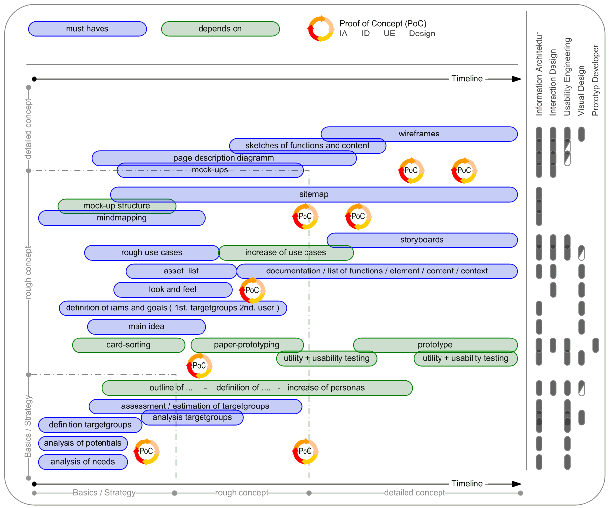
The deliverables are not for us. The deliverables are a means of communication with several people: manager, decision maker, client, designer, front-end developers, back-end developers, etc. Sometimes I have the feeling we overlook this from time to time. After I think about the project I have to ask myself, where will my deliverables and other efforts fit within the process of design? The following diagram describes different lines of work that will lead us to some questions each line must accomplish. Depending on these questions and topics I will outline the basis, basics and deliverables for which each skill and ability which is necessary.

Image_6___schedule of UXD-P_small version

Image_6

schedule of UXD-P ___ better view – schedule 1238px x 1030px


UXD-P – my conclusion

I studied architecture and town planning. And just like town planning and architecture isn’t just for architects and art lovers, the internet isn’t just for computer users and developers. Similarly, just as the towns and the cities are for the inhabitants and architecture is for the users of a building, so products and applications are for the user, the customer, the member and not for the people who build them.

In every kind of process we should act in a team but in the process of UXD-P it is absolutely essential that we have to think parallel, with the same focus . We have to act in a team, although every team member is a kind of lawyer: lawyer of budget, of the client, of utility, of usability, of look and feel, of brand and finally of the user himself. Because at the end of the project, our user/customer is the final judge.

Good design is not only interface, or look and feel, or technology, or hardware, or how it works. It is every detail, like the structure, the labelling, the border of a button or a little icon. Finally, it is the sum of every element. I believe that a shared vision of a group of creators will have more potential than individual creativity. And that is the point where creativity meets expectation. The point of view on IA and design and the process to get to a well-designed product will be changed by UXD-P.

The persons who use the application or other object that we invent are the real “architects” of the “architecture” – the real “inventor” of the design. The more we know about our users, the more likely we are to meet their needs.

As the capabilities of interactive applications and the internet go forward and grow, more and more consumers use the applications and the various possibilities in new and different ways. We must think about all aspects of user experience.

And I will ask you once again: Is it just one who is responsible or is it the team which is in charge of UXD-P?

Personally, I believe it is the process of planning and designing for User Experiences (and so I think it’s the team which is in charge), but the overview has to have an experienced planner as a kind of captain.


The most common cause of an ineffective website (one that doesn’t deliver value to both the business and its intended constituents) is poor design. The products have to follow, to cover the functions and the experiences. The lack of clear organization, navigation and values of brand and mood mean that people will have an unintentional and maybe bad experience, rather than one that will meet the business’s relationship objectives for each individual. User experience design and planning is a fundamental component to the creation of successful digital products, applications and services.

UXD-P is UXdesign and planning- - In my estimation there are distinctions between Design and Planning.

Design is usually considered in the context of arts and other creative efforts. When I think of design in the UX process it focuses on the needs, wants, and limitations of the end user of the designed goods, but mainly on the visual parts and the mood. A designer has to consider the aesthetic-functional parts and many other aspects of an application or a process.

The planning part provides the framework. The term "planning" describes the formal procedures used in such an endeavors, such as the creation of documents, diagrams etc. to discuss the important issues to be addressed, the objectives to be met, and the strategy to be followed. The planning part is responsible for organizing and structuring to support utility, findability and usability.

I strongly believe that both parts – design and planning – have to work closely together. Every team member should have the ability to think cross-functionally and to anticipate consequences of activities in the whole context.

I’ve often seen timelines like this …

Image_8___

and this doesn´t work for UXdesign and planning …

I give a timeline the preference which looks like this:

Image_9___

... to develop a UXdesign and UXplanning.

And in the center of this team and of this process should stand the leading person – the user!

Image_9___basis points of UXD-P

Post by 넥스트리소프트 데꾸벅(techbug)
, |


들어가기에 앞서
얼마전 가트너에서 발표한 2009 웹 10대 전략을 아래와 같이 요약하였다.
1. 가상화(Virtualization)
2. 클라우드 컴퓨팅(Cloud Computing)
3. 서버(Servers)
4. 웹 기반 아키텍처(Web-Oriented Architectures)
5. 엔터프라이즈 매쉬업(EnterpriseMashups)
6. 특성화 시스템(Specialized Systems)
7. 소셜 소프트웨어와 소셜 네트워킹(Social Software and Social Networking)
8. 통합 커뮤니케이션즈(Unified Communications)
9. 비즈니스 인텔리전스(Business Intelligence)
10. 그린IT(Green IT)

대부분의 2009년 웹트렌드는 소셜네트웍, 모바일, Saas라 불리는 클라우딩 컴퓨팅에 초점을 맞추고 있다. 대부분이 2008년에 이미 이슈화 되었고 앞으로 기술전망에서 언급된 내용이였다. 다만 전망하지 못한 부분들이 있었는데 금융위기에 관련된 부분이 조금 추가되었을 뿐이다. 
그런데 그에 따른 디자이너들의 웹트렌드에 대책은 어느정도 만족할수 있을까라는 생각에 여러사이트들을 둘러보다가 좋은 정보가 있어 포스팅한다. 


디자이너들은 항상 새로운것을 요구하고 여러가지를 경험하는 것을 좋아합니다.
작업물에 사용자의 반응을 지켜보는것을 좋아하고 가능한한 주류보다는 남들과 차별화된 디자인적 접근을 좋아합니다. 결론적으로 남들과 다르게 접근하고 새로운 트렌드를 추구하는 디자이너를 위해 최근 몇개월간의 추세를 기준으로 2009년 웹디자인트렌드를 작성합니다..
 - 원본글 중에서


1. Letterpress

최근 몇개월간 이제껏 많이 사용하지 않았던 온라인 서비스를 하는 웹사이트에서 인쇄물에서의 글꼴과 같은 웹사이트들이 많이 출현하였습니다. 이미 국내의 네트웍 인프라 덕분에(?) 국내의 다수 웹사이트는 이미 이러한 대형 인쇄타이포를 이용한 웹사이트들이 많이 있습니다. 특히 웹에이젼시나 디자인 전문 포트폴리오 사이트의 경우에는 더더욱 그렇습니다.


[ http://365daysofastronomy.org/ ]


[ http://www.alexbuga.com/v8/ ]


[ http://brightkite.com/ ]


[ http://www.powerset.com/ ]


[ http://www.storenvy.com/ ]


[ http://unblab.com/login ]


[ http://www.leemunroe.com/ ]


[ http://2d2.es/ ]


[ http://www.respiromedia.com/ ]


2. Rich User Interfaces

기쁘게도 현대 웹사이트와 웹애플리케이션에서의 UI는 점점 더 뷰티플해지고 사용하기 좋아집니다. 그러나 최근 몇년 동안은 이러한 애플리케이션의 사용자경험이 환상적으로 향상되고 전통적인 데스크탑애플리케이션에 거의 가깝게 진화하고 있습니다.

특히 지난해에는 더 많은 사이트들에서 다양한 디자인 요소로써 사용되고 있고 사용성을 중시한 인터페이스들이 나타나기 시작하였습니다.  웹동향과 마찬가지로 RIA, Flex, Javascript UI Libraries의 영향으로 이러한 현상은 점점더 두드러 질것으로 예상됩니다.


[ http://www.quicksnapper.com/ ]


[ http://www.quicksnapper.com/ ]


[ http://dc2009.drupalcon.org/> ]

위의 두 예제는 웹애플리케이션 디자이너들에게 좀더 기능적으로 접근하고 표현하기 위해 그들의 경험을 향상시키고 있는 증거이다.


[ http://konigi.com/interface/mobileme-calendar-date-selector ]


[ http://www.newspond.com/science/ ]


[ http://www.howcast.com/categories ]


[ http://moodstream.gettyimages.com/ ]


[ http://www.gettyimages.com/ ]


[ http://listen.grooveshark.com/ ]


[ http://www.kontain.com/#home ]


3. PNG transparency

투명한 PNG 포맷은 불행히도 IE6에서는 지원하지 않지만(IE6에서도 편법적으로 지원합니다.) 좀더 사용자들에게 좋은 이미지를 제공하게 해둔다. 이전까지의 투명이미지는 PNG만큼의 쿨러티를 지원해주지 않았으나 PNG의 투명도를 이용한 디자인은 아래와 같이 근사한 사이트를 디자인 하게 해준다. 

IE6에서는 setPNG와 같이 자바스크립트 나 url(data: /base64)와 같은 CSS만으로도 가능하겠지만 디자인적인 측면에서 투명이미지 사용으로 인하여 얻는 효과는 무궁무진합니다. 


[ http://rustinjessen.com/ ]


[ http://dc2009.drupalcon.org/ ]


[ http://24ways.org/ ]


[ http://labs.paulicio.us/viewport/#2 ]


[ http://www.restroom.nl/ ]


[ http://www.wishingline.com/notebook/ ]


[ http://carrotcreative.com/ ]


4. HUGE Typography

사용자에게 좀더 어필하기 위하여 36픽셀이상의 폰트들이 많이 사용되고 있습니다. 특히 웹디자인 에이젼시나 포트폴리오 사이트, 제품사이트에서 많이들 사용됩니다. 국내의 웹사이트들은 이미 많이들 사용하고 있죠? 다만 깨끗한 한글폰트를 사용하는 사이트는 그리 많지 않고 대부분이 영어라는 점에서 아쉬운점은 있습니다.


[ http://www.francescomugnai.com ]


[ http://madebygiant.com/ ]


[ http://theautumnfilm.com/red-white-sale/us.html ]


[ http://www.signalapps.com/ ]


[ http://www.blackestate.co.nz/ ]


[ http://www.onefastbuffalo.com/ ]


[ http://www.shiftpx.com/ ]


5. Font Replacement

기존의 폰트에서 요즘은 다른 폰트들로 바껴가고 있습니다. 타이포그라피에 더 많은 주의를 기울이는 디자이너들 만큼 웹사이트의 본문에 더 세심한 주의를 기울입니다. 기존의 helvetica, arial, georgia,verdana체에서 다양한 폰트들로 웹사이트가 채워졌습니다. 재미있는것은 이러한 폰트들이 웹사이트의 디자인을 결정하기도하며, 사용자들에게 더 어필한다는 것입니다. 


[ http://blog.iso50.com/ ]


[ http://365daysofastronomy.org/ ]


[ http://www.chigarden.com/ ]


[ http://www.nonesuch.com/journal ]


[ http://daily.creattica.com/ ]


6. Modal Boxes (Lightboxes)

Modal boxes (dialog windows)는 차세대 팝업화면입니다. 이미 모든 브라우저에서 팝업차단기능때문에 div 태그와 자바스크립트를 이용한 팝업을 많이 겪어 보았을 것입니다. 이러한 팝업도 둥근 모서리의 애플리케이션 디자인처럼 진화하고 있습니다.


[ http://typedeskref.com/ ]


[ http://www.realmacsoftware.com/rapidweaver/overview/ ]


[ http://listen.grooveshark.com/ ]


7. Media Blocks

점점 더 빠른 네트웍인프라가 좋아지다 보니 이러한 미디어 블럭들이 많이 사용되고 있습니다. 사용자들에게 좀더 빠르고 사용하기 편하고 접근성이 좋은 디자인을 제공하기 위하여 자바스크립트와 플래쉬를 이용한 기술들이 주류를 이루고 있습니다.


[ http://www.getbackboard.com/ ]


[ http://www.goodbarry.com/ ]


8. The Magazine Look

대부분의 블로그, 기술 포트폴리오 사이트등등에서 게시물의 배치, 타이포그래피등 전통적인 인쇄방식의 그리드 기반의 디자인이 점점 인기를 끌고 있습니다. 현재 보시고 계신 티스토리 블로그 조차도 잡지와 같은 그리드 형식을 뛰고 있는것이 많으며 특히 뇌입어블로그의 스마트에디터의 경우느 이러한 그리드-레이아웃 템플릿 조차도 지원하고 있습니다.


[ http://www.alpha-multimedia.com/category/blog ]


[ http://www.objectifiedfilm.com/ ]


[ http://www.inspirationbit.com/sources-of-inspiration-to-the-rescue/ ]


[ http://www.good.is/ ]


[ http://cutandtaste.com/ ]


[ http://www.nonesuch.com/journal ]


9. Carousels (Slideshows)

Carousels은 자신이 원하는 페이지를 마우스 클릭이나 키보드의 화살표만으로 이동할수 잇는 슬라이드 네비게이션의 필수요소입니다. 이러한 슬라이드쇼는 사용자들로 하여금 더 쉽게 원하는 컨텐츠를 찾을수 있도록 배려해 줍니다.

전통적인 탑-레프트-컨텐츠 레이아웃에서 좀더 사용자들에게 쉽고 빠르게 정보를 전달하기 위해서 더 유용한 방식의 슬라이드 네비게이션이 강조되는 경향이 많습니다. 뇌입어의 웹캐스트도 같은 현상이라고 봐도 될런지... 


[ http://www.itv.com/ ]


[ http://money.cnn.com/ ]


[ http://music.yahoo.com/ ]


[ http://vickycristina-movie.com/ ]


10. Introduction Blocks

대부분의 웹사이트에서 상단-왼쪽영역은 가장 중요한 부분입니다. 이부분은 사용자에게 중요한 메세지나 권리들을 알려주고 가능한 빨리 메세지를 전달하는 역할을 합니다. 사실 많은 디자이너들이 웹애플리케이션이나 회사웹사이트디자인이든 온라인 서비스든 포트폴리오 사이트이든 상단-왼쪽 영역은 슬로건이나 간단한 소개를 넣는 것을 좋아합니다. 이곳에는 생생한 타이포그래피나 강력한 인상을 위하여 임팩트한 이미지들이 많이 사용됩니다. 보통 250~400픽셀의 높이로 사용됩니다. 디자인 요소 중 정보전달의 중요한  "강"-"약" 포인트에서 "강"에 해당되는 임팩트가 주로 들어가는 영역입니다. 


[ http://www.shannonmoeller.com/ ]


[ http://productplanner.com/ ]


[ http://www.45royale.com/ ]


[ http://revyver.com/ ]


[ http://creamscoop.com/ ]


더 많은 정보는 이곳에서 확인하세요! 


Post by 넥스트리소프트 데꾸벅(techbug)
, |

IE7 나온지가 얼마나 됐다고 IE8 사용성 테스트를 해야 한다니..복장이 터질지경이다.

현재 프로젝트에서 사용자중 가장많이 차지하는 부분이 IE6인데..기본 개발 브라우저는
IE6,IE8,IE9, FF2,FF3, Opera9에서 까지 잘 보여야 한다니.....

일전에 포스팅한 IE8출시에 따른 호환성테스트 글에서 언급했지만
IE8에서 IE7과 같이 쓰려면 다음과 같은 Meta태그를 넣어주면된다.

<meta http-equiv="X-UA-Compatible" content="IE=EmulateIE7" />

출처 : MS IE Compatibility Site


아래 내용은 MS의 고객지원센터에서 발췌한 글이다.

'Designer > UX' 카테고리의 다른 글

UX 디자인 기획은 원맨쇼가 아니다  (6) 2009.03.04
2009년 유행할 웹디자인 트렌드  (13) 2009.01.19
PhotoshopExpress : 포토샵이 웹으로?  (2) 2008.03.28
칼라에 대한 고찰  (0) 2008.02.21
IE6 PNG background없애기  (0) 2008.02.21
Post by 넥스트리소프트 데꾸벅(techbug)
, |
웹어서 포토샵의 기능을 쓸수 있게 해주는 서비스가 생겨 포스팅한다.

사실 이러한 간단한 이미지편집기능을 웹에서 해주는 Picnik 서비스가 있으나 왠지 모르게 조금 허술하다는 생각을 했었는데 포토샵 익스프레스는 포토샵의 모든기능을 웹에서 쓸수 있게 해준다. 단 회원가입해야지만 사용할수 있는데 test Drive에서 테스트 해볼수 있다.
플래쉬 베이스라 그런지 느린것이 단점이다..

사용자 삽입 이미지


'Designer > UX' 카테고리의 다른 글

2009년 유행할 웹디자인 트렌드  (13) 2009.01.19
IE8을 미리 대비하기  (0) 2008.06.13
칼라에 대한 고찰  (0) 2008.02.21
IE6 PNG background없애기  (0) 2008.02.21
favicon 생성기  (0) 2008.02.21
Post by 넥스트리소프트 데꾸벅(techbug)
, |

칼라에 대한 고찰

Designer/UX / 2008. 2. 21. 19:14
항상 디자인을 할때 칼라매치에 고민하다가 괜찮은 사이트하나(칼라러버) 발견

사용자 삽입 이미지


'Designer > UX' 카테고리의 다른 글

IE8을 미리 대비하기  (0) 2008.06.13
PhotoshopExpress : 포토샵이 웹으로?  (2) 2008.03.28
IE6 PNG background없애기  (0) 2008.02.21
favicon 생성기  (0) 2008.02.21
저작권 없는 무료 이미지 사이트 100선  (1) 2008.02.21
Post by 넥스트리소프트 데꾸벅(techbug)
, |
방법1 : -------------------------------------------------------------------------------------------------------------
<style type="text/css">
.png24 { tmp:expression(setPng24(this)); }
</style>

<script>
function setPng24(obj)
{
obj.width=obj.height=1;
obj.className=obj.className.replace(/\bpng24\b/i,'');
obj.style.filter = "progid:DXImageTransform.Microsoft.AlphaImageLoader(src='"+ obj.src +"',sizingMethod='image');"
obj.src='';
return '';
}
</script>

<table>
<tr>
<td bgcolor="blue"><img src=left.png class="png24"></td>
</tr>
</table>


방법2 -------------------------------------------------------------------------------------------------------
참조 : http://naradesign.net/wp/2006/12/15/100/


1. img 로 불러올 때

css에서
.png24 {
    tmp
:expression(setPng24(this));
}


이렇게 선언하고

js에서
function setPng24(obj) {
    obj
.width=obj.height=1;
    obj
.className=obj.className.replace(/\bpng24\b/i,'');
    obj
.style.filter =
   
"progid:DXImageTransform.Microsoft.AlphaImageLoader(src='"+ obj.src +"',sizingMethod='image');"
    obj
.src=''; 
   
return '';
}


이렇게 선언해 준 후에 사용하는 이미지에 class="png24"를 삽입.
BUT - 페이지를 한 번더 호출하는 경우가 발생 -_-;


2. background-image로 불러올 때

background: url(../images/asdf.png) no-repeat center top;
//CSS문서 위치를 중심으로 이미지 경로를 따질것

background
-image : none;
filter
: progid:DXImageTransform.Microsoft.AlphaImageLoader(src='../images/asdf.png',sizingMethod='scale');
//실제 읽어들이는 페이지를 중심으로 이미지 경로를 따질것


출처 : http://forum.standardmag.org


특수한 경우
필터 먹은 DIV 안에 있는 링크를 아무리 눌러도
클릭이 되지 않는 현상이 생깁니다. (IE-_-신발)

이 특수한 경우는 다음과 같습니다.

필터먹인 DIV
div {
   position
: relative;
  
// offset 설정이 되어버리는 순간 (absolute 마찬가지)
}


위와 같이 필터먹인 DIV에
position: relative, absolute 설정을 주면
안에 있는 링크는 무용지물이 되고 맙니다.

해결방법
1. 필터 먹인 DIV에는 position: static;
2. 그 안에 들어있는 링크(a)에 relative 혹은 absolute 를 주세요.

'Designer > UX' 카테고리의 다른 글

PhotoshopExpress : 포토샵이 웹으로?  (2) 2008.03.28
칼라에 대한 고찰  (0) 2008.02.21
favicon 생성기  (0) 2008.02.21
저작권 없는 무료 이미지 사이트 100선  (1) 2008.02.21
한국의 색상  (3) 2008.02.21
Post by 넥스트리소프트 데꾸벅(techbug)
, |

favicon 생성기

Designer/UX / 2008. 2. 21. 19:09
매일 포토샵으로 아이콘 만들기 귀찮았는데 png이미지를 알아서 아이콘으로 만들어주는 사이트가 있어 포스팅한다.

사용자 삽입 이미지

Post by 넥스트리소프트 데꾸벅(techbug)
, |

출처 : http://www.virtualhosting.com/blog/2007/100-legal-sources-for-free-stock-images/


Most Popular

These resources are some of the most popular free stock image sites on the Web and with good reason. If you’re looking for some mainstream images, these are the first place to try.

  1. FreeFoto: FreeFoto.com claims to be “the largest collection of free photographs on the Internet.” They’re available for offline projects as well, as long as you’re not using them to make a profit.
  2. KAVEWALL: Look for images and textures in unique categories like tattoo, smoke, and food.
  3. Digital Dreamer: Free, royalty-free stock images can be found here.
  4. Free Photos Bank: This features a handful of the newest photos in their directory, so check back often.
  5. Free Digital Photos: Find gorgeous, easy-to-download photographs in categories like animals, celebrations, home & garden, and lots more.
  6. PD Photo: Browse through the categories and subcategories in this site’s database, most of which depict the urban and rural landscapes of the United States.
  7. Visipix: Search over a million photographs and fine art pieces.
  8. Cepolina: On cepolina, you can choose to save photos in up to five different formats.
  9. DexHaus: A wide array of beautiful images are found on this well-organized site.
  10. FreeStockImages.net: Chances are you’ll find whatever it is you’re looking for on this terrific site.
  11. TurboPhoto: TurboPhoto has 10 categories keep the high res photos easy to find.
  12. Yotophoto: An immensely popular site, Yotophoto is worth checking out.
  13. Stockvault: Search by photo subject or by the newest and most popular photos on Stockvault.
  14. Dreamstime: While most of the photos on this site cost a fee (some as low as $0.26/image), Dreamstime provides a few free stock photos.
  15. Open Stock Photography: This site offers over one million images for you to download and use however you want.

Community-Powered Content

In addition to being a great source of images, these sites host forums, file sharing and other features designed to nurture community spirit.

  1. Image After: Search tons of free photos on this site while meeting other photography lovers on the forum.
  2. Unprofound.com: Use the images however you want, just make sure you let them know where you’ve published it!
  3. Font Play: This site has nearly 10,000 free photos for you to use any way you want. Look under the “Guests” heading to search by your favorite contributor.
  4. Studio 25: This attractive site lets you upload and search images.
  5. Vintage Pixels: Share your archived photos with other users. Download images that work for your Web site or blog.
  6. Abstract Influence: Search for the stock images you want while talking about photography with other visitors on the site’s forum.
  7. amygdela’s atmosphere: This site hosts a forum and a blog, as well as tons of stock images.
  8. Every Stock Photo: A forum and blog keep this stock image site fun and informative.
  9. Photocase: The good people at Photocase are “prettying up the world.” Check out their great library of stock images.
  10. deviantART: Provocative photos spawn great debates on the site’s forum.

Artists Welcome

It’s probably pretty safe to say that every stock image site on the Web needs the help of photographers to keep it running. The following sites, however, really cater to the needs of photographers, designers, and other artists even though they’re donating their photos for free.

  1. Stock.xchng: Check out the gorgeous shots organized into lots of different categories, making your search as easy as possible.
  2. Morguefile: Browse thousands of beautiful photos in this site’s archives, but don’t miss their job board either!
  3. Woophy: This site organizes photographs by geographical location. Enter into their contest for a chance to win great prizes.
  4. The NOAA Library: Breathtaking science and nature shots are available at this site. Don’t forget to check out the “Meet the Photographers” page which includes short bios and descriptions of the featured photogs.
  5. Pixel Perfect Digital: Get tons of free stock images and read the latest in photography news.
  6. Free Range Stock: Photographers are rewarded for giving away their pictures by getting a percentage of the site’s total ad revenue.
  7. AMG Media: As long as you give credit to the photographer somewhere on your site, these images are yours for the taking.
  8. Free Photographs Network: Submit photographs for others to see, or download some for your own use.
  9. FreePhotos.com: If you’re a photographer, submit your best pictures for a chance to win cool prizes.
  10. PhotoRogue.com: If you can’t find a picture of anything you want, go to PhotoRogue.com and make a request for whatever it is you’re thinking of. Photographers will take pictures for you — and it’s still free!
  11. Graphicsarena.com: Submit your photos for consideration.
  12. Fotogenika: Send in your photos for other visitors to use on their personal sites.
  13. Image Temple: Send in your own photos to be included in this site’s gallery.
  14. Flickr: Most of the photos on this site are not free, but a clever search will turn up some real goodies.
  15. FreeLargePhotos.com: Downloaders must link their chosen photo back to the site, which gives the photographer credit.

Less is Sometimes More

Just because the sites listed in this section aren’t as expansive as some of the others on our list doesn’t mean they’re not worth checking out. Sometimes less can really means more, especially when it comes to narrowing down your search or coming across hard-to-find treasures.

  1. Mayang’s Free Texture Library: Download high-res textures from this site, which has categories like architecture, buildings, plants, wood, and stone.
  2. Liam’s Pictures from Old Books: Discover hard-to-find illustrations from old books, “most with multiple high-resolution versions.”
  3. Texture Warehouse: Find interesting textures at this great site.
  4. Free Stock Photos: Nature shots and religious themes are abundant at this free stock photography site.
  5. BurningWell: Totally free images are organized into categories like animals, bugs, cityscapes, people, plants, and textures.
  6. Design Packs: New images and themes are added monthly, so this site may not be a well kept secret too much longer!
  7. Amazing Textures: This site is a web designer’s dream. Browse hundreds of high res textures and backgrounds.
  8. Aarin Free Photo and Digital Images: These site boasts nearly 1,000 fantastic images for you to choose from.
  9. Image Base: On Image Base, breathtaking photographs are organized in categories like nature, concept, people, and city.
  10. Majestic Imagery: All the photos on this site were taken by the host.
  11. diwiesign studio: All the images are free, but if you’re a frequent user, you might want to consider making a donation to this photo entrepreneur.
  12. Zurb Photos: Photographer Bryan Zmijewski uploads his own images onto this site.
  13. tOfz.org: Find urban images for free, but consider making a contribution to this artist’s cause.
  14. LIGHTmatter: These gorgeous photos were all taken by the same artist, who also hosts the Web site.
  15. Insect Images: Find all kinds of photos of creepy crawlers here.

Stock Images Plus

There is a lot more to legal stock images than just a bank of free photos. The sites in this section all go beyond being a basic stock photography resource by offering more services that will help improve your search for and use of stock images.

  1. Creative Commons: This nonprofit site shows you how to license your images once they’ve been uploaded onto your site.
  2. Free Images: This British site offers free images as well as wallpapers, desktops, and a section of ideas and tips that will help you customize your image experience, whether you’re a photographer or not.
  3. Creating Online: This stock images site is an excellent resource for any new blogger or Web site developer. Learn about editing your images, hosting, domains, and more.
  4. ArtFavor: Find stock images, fonts, sounds, flash clipart, and more, are all on this terrific site.
  5. Geek Philosopher: Find hilarious and beautiful stock images side by side. Also check out the site’s blog and web hosting capabilities.
  6. Gimp Savvy: In addition to finding great images, Gimp Savvy also gives tips on photo touchups, making a collage, and more.
  7. Creativity 103: Find free abstract images and videos on Creativity 103.
  8. Afflict.net: Search photos and textures while learning about images in the tutorials section.
  9. One Odd Dude: Download photographs, wallpapers, textures, and more on One Odd Dude.
  10. Discover: Search for your favorite subjects or web sites, and hundreds of free icons, stock images, and other designs will appear.
  11. Photoshop Support: On Photoshop Support, browse photos, read the tutorials, and check out the great imaging tools.
  12. AncestryImages.com: Search antique portraits and use the geneaology resources link to connect you to even more tools.
  13. Free Media Goo: Download free stock images, audio, and video on Free Media Goo.
  14. National Park Service Digital Image Archive: Check out beautiful pictures taken for the NPS. This site also provides a link to the NPS official site.
  15. <New York Public Library Digital Gallery: Browse through thousands of prints, illustrations, and photos. Read the photographic services and permissions page for more information on downloading high-res files.

Miscellaneous

These image sites don’t necessarily fit into one particular category, but they’ve still got a lot to offer.

  1. Backgrounds Archive: Find beautiful backgrounds for your desktop or MySpace page.
  2. USDA Agricultural Research Service: The government’s Agricultural Research Service sponsors this “complimentary source of high quality digital photographs.”
  3. Holy Land Photos: Poignant photos of the Holy Land are available here.
  4. Stockcache.com: This site makes organizing your downloads easy.
  5. Four Bees: Browse through the stock images directory, or download royalty free music and video on Four Bees.
  6. Clipmarks: Search for free stock images with this handy tool.
  7. Yellowstone Digital Slide File: These beautiful shots of Yellowstone National Park are available for use by the media and public.
  8. Plants of Hawaii: Perfect for any botanist, this site has over 45,000 images of Hawaiian plants.
  9. Microshots: This site specializes in microscopic images.
  10. IN TEXTURE: Free stock textures are plentiful on this site.
  11. Trip Album: This site is all in French, but the photos are divided into categories based on country, making it easy to figure out.
  12. Orange Trash: Find pictures about Hungary on this Web site.
  13. Public domain stock photos: Browse categories like backgrounds, food, nature, objects, and seasonal on this site.
  14. BAJstock: Written in both French and English, this stock image site has tons of photos for you to use for free.
  15. NWYK Stock Image Library: This hilarious site provides free images that capture the drudgery and playfulness of office life.

General

These stock image sites offer a wide range of photo subjects, perfect for casual browsing or a way to get ideas before you plan out your site.

  1. Public Domain Photos: Check out these gorgeous pictures of animals, cities, landscapes, and more.
  2. Bigfoto.com: Find photos of beautiful places all around the world, as well as fun shots in the Christmas, grafitti, or food categories
  3. Photogen: Look through the Top 10 gallery to find the most popular downloads in a preview-friendly thumbnail format.
  4. Free Pixels: Find free photos, logos, or other images on this site.
  5. DHD Multimedia Gallery: Search through thousands of basic photos.
  6. PIX: This site is so easy, you don’t even have to register to download.
  7. Photo Rack: New photos are featured at the bottom of the page, so check back often to make sure you don’t miss anything great.
  8. Free Stock Photos: On Free Stock Photos, each image comes with a description detailing its size.
  9. Barry’s Free Photos: This is a great site for finding all different kinds of images for your Web site.
  10. Cromavista: This site is all in Spanish but still easy to navigate if you’re not a native speaker.
  11. IronOrchid: Several different categories allow for an efficient search on IronOrchid.
  12. Image Blowout: Have fun looking through these unique photos.
  13. FreeImages.com: Tons of categories and subcategories make searching for photos on this site simple.
  14. ilovefreePhoto: This fun, attractive site makes searching for that perfect photo a little less frustrating.
  15. Free Photo Station: Loads of great photos are all free on this site.

'Designer > UX' 카테고리의 다른 글

IE6 PNG background없애기  (0) 2008.02.21
favicon 생성기  (0) 2008.02.21
한국의 색상  (3) 2008.02.21
매킨토시의 휴먼인터페이스 - 인터페이스 디자인 원칙  (0) 2008.02.21
영문폰트를 웹폰트로  (0) 2008.02.21
Post by 넥스트리소프트 데꾸벅(techbug)
, |

한국의 색상

Designer/UX / 2008. 2. 21. 19:05
원래 CMYK색인데 포토샵에서 RGB값으로 바꾸어서 웹상에서 사용할 수 있도록 하였습니다.
무채색계(無彩色界)
흑백 1D1E23 93,89,83,52
백색 FFFFFF 0,0,0,0
회색 A4AAA7 38,27,31,0
구색 959EA2 45,32,32,0
치색 616264 72,64,62,4
연지회색 6F606E 55,58,40,20
설백색 DDE7E7 12,4,7,0
유배색 E7E6D2 9,5,18,0
지배색 E3DDCB 6,6,17,4
소색 D8C8B2 10,15,26,5
적색계(赤色界)
적색 B82647 21,98,68,8
홍색 F15B5B 0,80,60,0
적토색 9F494C 29,80,64,17
휴색 683235 40,80,66,44
갈색 966147 31,61,73,21
호박색 BD7F41 21,51,84,8
추향색 C38866 19,48,61,6
육색 D77964 11,62,59,2
주색 CA5E59 15,75,62,4
주홍색 C23352 18,94,60,5
담주색 EA8474 4,59,50,0
진홍색 BF2F7B 20,94,17,4
선홍색 CE5A9E 16,79,2,0
연지색 BE577B 19,77,28,7
훈색 D97793 9,64,20,2
진분홍색 DB4E9C 9,84,0,0
분홍색 E2A6B4 7,39,14,1
연분홍색 E0709B 6,69,11,1
장단색 E16350 6,75,70,1
석간주색 8A4C44 30,71,65,30
흑홍색 8E6F80 40,54,31,15
황색계(黃色界)
황색 F9D537 3,13,89,0
유황색 EBBC6B 6,25,67,1
명황색 FEE134 2,7,89,0
담황색 F5F0C5 4,2,27,0
송화색 F8E77F 4,4,62,0
자황색 F7B938 2,29,89,0
행황색 F1A55A 3,40,73,0
두록색 E5B98F 8,27,45,1
적황색 ED9149 4,51,80,0
토황색 C8852C 18,50,97,5
지황색 D6B038 14,26,91,3
토색 9A6B31 30,54,91,20
치자색 F6CF7A 3,18,61,0
홍황색 DDA28F 9,39,38,2
자황색 BB9E8B 22,33,40,7
금색
별색
청록색계(靑綠色界)
청색 0B6DB7 89,56,0,0
벽색 00B5E3 73,5,4,0
천청색 5AC6D0 59,0,20,0
담청색 00A6A9 96,4,40,0
취람색 5DC19B 62,0,51,0
양람색 6C71B5 64,58,0,0
벽청색 448CCB 72,36,0,0
청현색 006494 99,59,22,3
감색 026892 93,57,26,2
남색 6A5BA8 68,73,0,0
연람색 7963AB 60,69,0,0
벽람색 6979BB 64,52,0,0
숙람색 45436C 86,84,40,9
군청색 4F599F 80,73,6,0
녹색 417141 82,44,95,9
명록색 16AA52 81,5,94,0
유록색 6AB048 64,8,97,0
유청색 569A49 72,20,96,1
연두색 C0D84D 29,0,87,0
춘유록색 CBDD61 24,0,78,0
청록색 009770 97,15,74,0
진초록색 0A8D5E 87,26,82,1
초록색 1C9249 85,20,98,2
흑록색 2E674E 89,52,83,9
비색 72C6A5 55,0,45,0
옥색 9ED6C0 38,0,30,0
삼청색 5C6EB4 71,59,0,0
뇌록색 397664 74,27,59,6
양록색 31B675 74,0,74,0
하염색 245441 83,43,75,39
흑청색 1583AF 84,39,17,0
청벽색 18B4E9 69,8,0,0
자색계(紫色界)
자색 6D1B43 41,95,45,40
자주색 89236A 40,96,18,20
보라색 9C4998 42,85,1,1
홍람색 733E7F 58,85,10,15
포도색 5D3462 70,90,35,20
청자색 403F95 90,90,1,1
벽자색 84A7D3 47,25,1,1
회보라색 B3A7CD 28,32,1,1
담자색 BEA3C9 23,36,1,1
다자색 47302E 75,86,85,35
적자색 BA4160 15,86,42,13
Post by 넥스트리소프트 데꾸벅(techbug)
, |
1) 은유-Metaphor

  사람들의 지식을 이용해 Application의 개념과 특징을 전달하고 이해시킨다

- 친숙한 아이디어 포함한 메타포사용
- 명확한 메타포 사용
  *사용자가 쉽게 컴퓨터 환경에 적응할 수 있도록 한다.
     .사무실의 folder - 문서보관
     .Computer folder - 전자문서보관, 여러형식의 데이타보관
     .사무실의 desk - 문서작성등의 작업
     .Computer desktop - 각종 작업의 기본 구역
     .사무실의 휴지통 - 각종 쓰레기 버림
     .Computer 휴지통 - data 버림
     .식당의 메뉴와 Computer상의 행동선택을 메뉴로 하는 것 등.

  *메타포의 용도는 비슷하지만 실행에 대한 제한은 컴퓨터마다 상이
  *메타포가 제시하는 용도와 컴퓨터 능력간의 균형을 맞추어야 한다.


2) 직접조작-Direct Manipulation

  컴퓨터에 의해 묘사된 object를 직접 제어하고 있다는 느낌을 갖도록 하기위한 조작방식을 말한다.

 - 물리적 행동이 곧 컴퓨터의 object를 제어한다.
 - 사용자는 물리적 결과를 기대하고 feedback도 기대한다.
 - 사용자는 명령어 실행여부를 알고 싶어한다.
 - 명령어 실행 불가시 이유와 대체방안을 알고싶어한다.
  *실행에 대한 feedback은 적절한 에니메이션이 필요
     .drag
     .click
     .cursor의 위치 조작
     .drawing 도구의 움직임 - 라인 형성


3) 보고 지정하기-See and Point

  Pointing device인 mouse등으로 사용자와 computer와의 상호작용하도록 하는 것을 말한다.

Macintosh desktop에서의 기본 패러다임

 -사용자가 하고 있는 일을 screen 상에서 볼 수 있다.
  i.사용자가 관심있는 object 선택
   ii.object가 실행할 행동지정(메뉴등으로 지정)
   iii.실행(메뉴실행, 직접실행)
     .document icon click > file menu > print

  -사용자가 자신이 보고있는 것을 지정할 수 있다.
   i.사용자가 object를 연관된 행동을 위해 drag해서 실행
     .document icon drag > 휴지통에 (삭제)
     .document icon drag > 폴더에 (복사 및 이동)


4) 일관성-Consistency

  일관성은 어떤 표준요소에 의해 애플리케이션 내부나 애플리케이션 간의 학습전이 효과를 창출할 수 있도록 서로 공통성을 찾아주는 과정이다.

이런식의 제작은 다른 애플리케이션으로 기본적인 조작의 학습전이 효과를 창출할 수 있다. 목표 사용자 집단에 요구와 관련된 일관성 문제들을 보면서 문제를 다루어야 한다.

 -시각적 일관성
   i.그래픽 언어의 학습과 학습전이 용이
   ii.한번의 학습은 필요

 -제품의 일관성 고려시 자문할 사항
   i.제품자체내에서 일관성이 이루어지고 있는가?
   ii.이전버젼과 비교해서 일관성이 이루어지고 있는가?
   iii.인터페이스 표준과 관련해서 일관성이 이루어지고 있는가?
   iv.metaphor 사용에서 일관성이 이루어지고 있는가?
   v.사용자의 기대와 비교해서 일관성이 이루어지고 있는가?


5) WYSIWYG-What You See Is What You Get

  "보이는 것을 그대로 얻는다."
스크린에서 보는 것과 print후 얻게되는 출력물간에는 거의 차이가 없어야 한다.

 -폰트, 폰트내용과 format을 모두 제공
 -폰트, 폰트내용과 format을 변형시 즉시 볼 수 있어야 한다.
  *사용자가 보여질 것에 대해 계산을 하도록 하면 안된다.


6) User Control-사용자 조절

  사용자가 실제 참여하는 것처럼 느끼도록 하여야 한다.
사용자는 실제 자기참여에 의한 학습의 능률이 뛰어나다.
 
 -사용자로 하여금 행동을 개시하고 조절하도록 한다.
  *작업수행에 필요한 능력을 사용자에게 제공하는 것과 사용자가 데이타를
   파괴하지 못하도록 방지하는 것간의 균형유지가 중요하다...


7) Feedback and Dialogue-피드백과 대화

  사용자가 제품의 상태에 대해 계속 알려준다.
작업수행시 가능한한 feedback 즉각 제공한다.

 -사용자의 입력행동시나 지정시 시각적,청각적 신호제공.
 -작동시간에 대한 display.
 -다른 작업처리로 인해 사용자 작업불가시 그 작업시간과 종류출력.
 -인터럽트 방법도 알려줄 수 있어야 한다.
 -유용한 메시지를 보여준다...


8) Forgiveness-관대함

  computer상의 행위를 대개의 경우 철회할 수 있도록 제작한다.
시스템상의 손상없이 일을 시도해 볼 수 있다는 느낌을 사용자가 갖도록 한다.

 -사용자들이 편안히 제품을 살펴볼 수 있도록 해야한다.
 -사용자의 최악의 실수에 대해서는 경고상자를 사용한다.
 -가능한한 경고상자가 없도록 자연스러운 시스템이 되도록 디자인 되어야 한다.


9) Perceived Stability-인지된 안정감

  사용자에게 개념적인 안정감을 제공한다.
 
-Interface는 분명하고 제한적인 object set와 이를 object에서 실행할 수 있는
  분명하고 제한적인 동작세트를 제공한다.
   .Desktop 제공, 일관성을 유지한 그래픽요소의 제공이 확고해야한다.
   .특정동작 사용방지시에 icon을 흐리게 처리한다.


10) Aesthetic Integrity-미적 완전함

  정보가 잘 조직되어 시각디자인 원칙에 일치하는 것을 말한다.   
 
-모든 것이 screen 상에서 display 기술수준이 훌륭해야 한다.   
 -장시간 화면을 보아도 훌륭히 보이도록 만들어야 한다.   
 -button과 icon, window의 적정수를 유지해야 한다.   
 -인터페이스의 그래픽언어를 준수해 표준 아이템의 의미를 바꾸지 않도록
   유의해야 한다.   
 -개념을 나타내는 데 있어 임의적(독단적) 그래픽이미지를 사용하면 안된다.
 -가능한한 표준심볼을 사용한다.
 -사용자가 기대하는 행동에 그래픽요소를 맞춘다 /누르면 눌러진듯한
   버튼, 스피너
 -사용자에게 외관조정의 재량을 부여한다.


11) Modelessness-비정형화

  사용자가 주어진 application에서 하려는 일을 할 수 있도록 비정형화된 기능을 만들도록 시도한다.


12) Knowledge of Audience-사용자에 대한 이해

  제품제작을 하면서 사용자에 대한 이해는 필수이다.
 
-사용자의 일과를 시나리오로 작성하여 분석한다.
 -사용자들의 작업공간의 환경에 대해 분석한다.
 -사용하는 툴의 한계를 분석한다.
 -실제작업현장을 방문하여 관찰한다.
 -prototype 제작 및 테스트를 한다.
 -사용자의 feedback을 듣고 요구를 반영하여 재평가한다.


13) Accessibility-접근가능성

  평균사용자와 다른 사용대상자를 분석하여 보다 근접한 제품을 만들어야 한다.
 
-연령, 스타일, 능력 등을 조사한다.
 -언어적, 육체적, 인식적 차이에 유의한다.
 -개개인의 특별요구사항들을 확인한다.

'Designer > UX' 카테고리의 다른 글

IE6 PNG background없애기  (0) 2008.02.21
favicon 생성기  (0) 2008.02.21
저작권 없는 무료 이미지 사이트 100선  (1) 2008.02.21
한국의 색상  (3) 2008.02.21
영문폰트를 웹폰트로  (0) 2008.02.21
Post by 넥스트리소프트 데꾸벅(techbug)
, |

사용자 삽입 이미지

'Designer > UX' 카테고리의 다른 글

IE6 PNG background없애기  (0) 2008.02.21
favicon 생성기  (0) 2008.02.21
저작권 없는 무료 이미지 사이트 100선  (1) 2008.02.21
한국의 색상  (3) 2008.02.21
매킨토시의 휴먼인터페이스 - 인터페이스 디자인 원칙  (0) 2008.02.21
Post by 넥스트리소프트 데꾸벅(techbug)
, |