UX 디자인 기획은 원맨쇼가 아니다
A lot of confusion and misunderstanding surrounds the term "user experience." The multitude of acitivities that can be labeled with these two words span a vast spectrum of people, skills and situations. If you ask for UX design (UXD), what exactly are you asking for? Similary, if someone tells you they are going to provide you with UXD for an application, website or intranet or extranet, what exactly are you going to get?
Is it just one person who is responsible or is it a team of people who are in charge of UXD? In this story I´ll sketch my ideas ofUXD based on my experiences and at the end of this story I will give you my answer.
Let us start at the beginning – UXD starts with experience – experience of the users. And so I will talk about the users first.
UXD-P – every person is an individual
Every person is an individual. Every person is in possession of different roles. For each individual there will be many roles and each person adopts a different role depending on the circumstances.
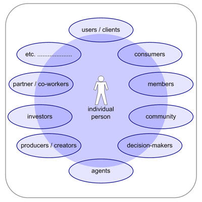
User Roles
Sometimes the individual person holds one role, but mainly he will hold quite a few roles like consumer, customer, user, client, investor, producer, creator, participant, partner, part of a community, member, and so on.
UXD-P – network of expectations, experiences and knowledge
Every user is multi-faceted – and is considerably more complex than they themselves can imagine – so it´s not very helpful just to talk to the user or ask him what he needs. We have to watch what people do; we have to listen to what people say and to recognize what decisions people make – and by observing we have to evaluate and understand why they do this and that. Why and what kind of visual elements will the user like, prefer and or understand? Why and what kind of mental model, navigation or function do they respond to?
Jakob Nielsen said “To design an easy-to-use interface, pay attention to what users do, not only what they say. Self-reported claims are unreliable, as are user speculations about future behaviour.” (Jakob Nielsen – Alertbox) and I agree – I think no statement can be objective. Perhaps the circumstances are not realistic or not reasonable for the person. Or maybe the person himself is not really in the “situation,” or he is being influenced by other factors (trying to please the tester for example). Or maybe he is trying to succeed with the test rather than trying and failing, which tells us so much more.
When all three perspectives (do, say, make) are explored together, we are able to realize the experience spectrum of the “normal” user/customer we are working for.
Jesse James Garrett said: “User experience is not about how a product works on the inside. User experience is about how it works on the outside, where a person comes into contact with it and has to work with it” (J.J.Garrett – The Elements of User Experience) .
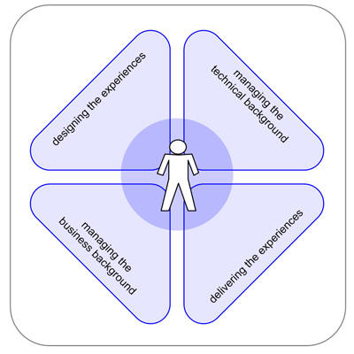
Experiences
Areas of experiences: different areas which effect the quality of communication
UXD-P – personal and individual
When we talk about experiences, we take the individual into consideration, including the subjective occurrences felt by the person who has the “confrontation” with what we want them to use. Experiences are momentary and brief – sometimes they are part of a multi-layered process or they are on their own.
Normally such know-how has been learned as a part of something or by itself and will be remembered in the same way – but that’s not always the case – and the person deals with the situation in a different way. If we look at their exeperience as a continuum, the user brings their experiences of the past to the interaction in the present and adds their hopes for the future. That future could be: to interact with their banking in a safe and secure way.
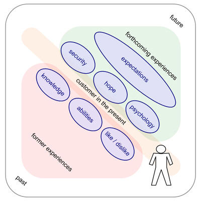
Flow of Experience
Flow of experience: the individual user/customer is always in the present – they act in the present. They are influenced by former experiences and current expectations.
UXD-P is taking the users’ views, behavior, and interactions, to figure out the emotional relationship between them and the thing we have built. For the most part these "people" and their experiences are unknown. It requires an appreciation of the customer: their journey, their personal history and their experiences.
It is the collective set of experiences, in the online-world, the offline-world, or even tiny little things (i.e. My coffee was cold this morning) that affects their experience of the products and the companies that represent them. It is about appreciating the individual user’s unmet needs, wants, capabilities and desires in a contextual way. It´s a box of experiences including the things the user saw, acted and felt. (BBC Two [12th February 2008, 9pm, BBC Two] had a program on rational thought. Highlights of the program include: Loss complex, Post-decision rationalization, Priming, Precognition. Watch highlights from the programme : http://www.bbc.co.uk/sn/tvradio/programmes/horizon/broadband/tx/decisions/highlights/ )
Experiences and expectations meet in the present. Both are inseperably combined, and every action we take takes both parts into consideration. When a person uses an application, he tries to understand what happens. He will always try to reference this to his past experiences. The moment is also tightly coupled to his expectations of his personal outlook.
At this point of “present” I think of the UX honeycomb of Peter Morville [1] …
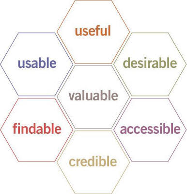
Morville’s "honeycomb"
honeycomb – Peter Morville (P.Morville – Facets of the User Experience)
In the present we have to deliver to the individual user and his specific task the best answers to following questions.
- Is the application useful for the individual user and his specific task?
- Is the application usable for the individual user and his specific task?
- Is the application desirable for the individual user and his specific task?
- Is the application valuable for the individual user and his specific task?
- Is the application accessible? Available to every individual user, regardless of disability?
- Is the target findable for the individual user and his specific task?
- Is the application credible for the individual user and his specific task?
In the UXD-P the whole team has to take the users’ views of the GUI and the interactions to figure out the emotional relationship between the brand and potential customers. It requires a common appreciation of the customer journey and their personal history: not only with the product and similar products, but also with similar experiences.
UXD-P – teamwork and cooperation
The first stage in discovering – to invent or design for the experience – is to take a new viewpoint about the people who buy and use the products and services we are designing. This is a birdseye view and from step to step we have to use the "mouseview," which is to say a detailed view from the user’s perspective, as we develop the application we have to switch between these views. Our main desire is to to respect, value, and understand the continuum of experience and expectations our users have .
UXD-P can sometimes be a slippery term. With all the other often used terms that float around: interaction design, information architecture, human computer interaction, human factors engineering, usefulness, utility, usability and user interface design. People often end up asking, “What is the difference between all these fields and which one do I need?” If the UXD is aimed to describe the user’s satisfaction, joy or success with an application, product or website, however we specify it, there are a few key essentials which need to be tackled and I have to point out the UX honeycomb of Peter Morville [1] a second time. Each of these points, as enlightened above, makes up a considerable component of the user experience. Each is made effective due to the design offerings from each of the following elements:
Usefulness is based upon utility and usability. This means the product is able to give exactly the right kind of service and what the user is expecting from it. And it´s the joy of reaching my aims and the joy of doing so easily. The information architecture is in charge of clarity of the information and features, lack of confusion, a short learning curve and the joy of finding. The designing of the interaction is essential for a successful and overall satisfying experience. So the interaction design has to answer the questions of workflow, logic, clarity, and simplicity of the information. Visual design is responsible for the clarity of the information and elements, simplicity of tools and features, pleasant or interesting appearance of the interface, the visual hierarchy, and the joy of look and feel. Accessibility is a common term used to describe how easy it is for people to use applications or other objects. It is not to be mixed up with usability which is used to describe how easily an application, tool or object can be used by any type of user. One meaning of accessibility specifically focuses on people with disabilities: physical, psychological, learning, among others. Even though accessibility is not an element of its own, it is important to notice that accessibility also plays a role on the whole user experience to increase the likelihood of a wide-ranging user experience. People tend to gravitate to something that is easier to use regardless of who it might have been designed for.
The UXD innovation process is a nonlinear spiral of divergent and convergent activities that may repeat over time. Any design process begins with a vision. This applies particularly to the UX process. A vision, however, is not enough to start design. As I mentioned before, we always have different circumstances, users and roles. Therefore, it is critical to accurately understand the end user’s needs and requirements – his whole experience and expectations. The UX process relies on iterative user research to understand users and their needs. The most common failure point in UX processes is transferring the perspective of users to UI design. The key is to define interaction first, without designing it. First, all the research (the user, product and environment) have to be organized and summarized in a user research composition. These lead to user profiles, work activities, and requirements for the users. The user research composition feeds directly into use cases. The use cases show steps to accomplish task goals and the content needed to perform interactions. Completed use cases are validated with the intended user population. This is a checkpoint to see if the vision is being achieved and the value is clear to users and the project team. The next step is to design the user interface, generating directly from the interaction definition. A primary concern with design is to not get locked into a single solution too early. To keep the project on time, this step should be split into two parts: rough layout and exact and detailed design. The rough layout allows experimentation and rapid evaluation. Detailed design provides exacting design and behavior previews of the final application that specify what is to be coded. Iterative user evaluations at both stages are connected to be fast and effective in improving GUI, design feedback, rapid iterative evaluations, and usability evaluations.
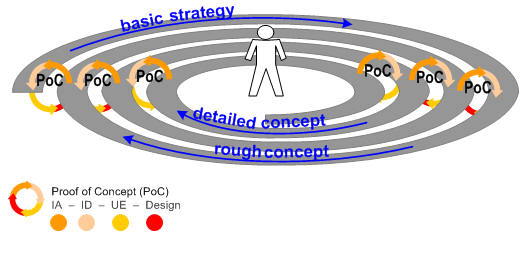
Image_7
design workflow – workcycle – workspiral
UXD-P – Gathering the elements
The diagram below presents the relationship of the elements above:
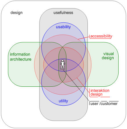
Elements of UXD-P
Lewin’s equation
Lewin’s Equation, B = f (P,E) ( B – Behaviour; f – Function; P – Person; E – Environment ), ...
... is a psychological equation of behaviour developed by Kurt Lewin. It states that behaviour is a function of the person and his or her environment [2].
There is a desired behaviour that we need to encourage, but we have no control over the person, so via interaction design, information architecture and interface design we control the environment and therefore generate the desired behavior. (see reference: books.google.com ).
UXD-P – many steps to go but every step is worth it
How do we involve our team, customer and our user/consumer? We can start at different points, but I like to think about the circumstances first. Where do we come from? Where are we? Where will we go? And who is “we”? “We” means each person who is involved in the project. Iin the centre of each effort stands the user. To get the user with his personal experiences and expectations into the project, the design team and the customer needs a combining glue / tool / instrument. I believe these are the personas of the “target users/consumers” in the process of UXD-P. If there are no personas the second or third choice are scenarios or the workflows (based on a certain user/person).
The management point of view for the most cases is also the view of our customer. It includes the user’s/consumer’s age, income, gender and other demographics. The perspective of UXD-P is to look at behaviour, goals and attitude.
To get a realistic persona we have to identify first of all the target users. Out of my experiences this is not only the task of our client to define the users and consumers – we have to support him. During the identification and characterization we have to go beyond demographics and try to understand what drives individual users and consumers to do what they do and these as detailed in quantity and quality as necessary and possible – like I mentioned above. The approach and the complexity of the characterization depend on the tasks, project and functionalities. Parallel to the very personal description we need a “picture” of the environment. For each persona we must define their business and/or their private concerns and aims. Do they want to research a product for purchase later? Are they concerned about not wasting time primarily? Do they just want to purchase something online as easy and quick as possible?
Depending on these personas we can formulate, discuss and prove scenarios – from the very beginning of the project, during the project and as check or analysis at the end of the project.
UXD-P – my blueprint of schedule – "todos" and deliverables
We are always asking and being asked: what are the deliverables. Throughout my career as an IA, UX-planner and designer, as well as during my study of architecture and town planning, I have constantly asked myself following the questions:
- What kind of project is it? What are the key points?
- What should our steps and milestones be in the project?
- What should our/my deliverables be?
- How can we/I explain the main idea?
I have realized that if I do not answer these questions previous to creating a deliverable, I waste more time and deadlines slip.
The deliverables are not for us. The deliverables are a means of communication with several people: manager, decision maker, client, designer, front-end developers, back-end developers, etc. Sometimes I have the feeling we overlook this from time to time. After I think about the project I have to ask myself, where will my deliverables and other efforts fit within the process of design? The following diagram describes different lines of work that will lead us to some questions each line must accomplish. Depending on these questions and topics I will outline the basis, basics and deliverables for which each skill and ability which is necessary.
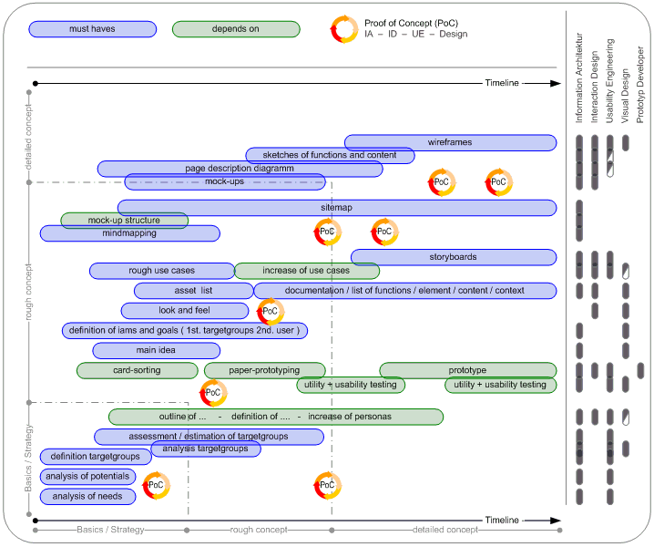
Image_6
schedule of UXD-P ___ better view – schedule 1238px x 1030px
UXD-P – my conclusion
I studied architecture and town planning. And just like town planning and architecture isn’t just for architects and art lovers, the internet isn’t just for computer users and developers. Similarly, just as the towns and the cities are for the inhabitants and architecture is for the users of a building, so products and applications are for the user, the customer, the member and not for the people who build them.
In every kind of process we should act in a team but in the process of UXD-P it is absolutely essential that we have to think parallel, with the same focus . We have to act in a team, although every team member is a kind of lawyer: lawyer of budget, of the client, of utility, of usability, of look and feel, of brand and finally of the user himself. Because at the end of the project, our user/customer is the final judge.
Good design is not only interface, or look and feel, or technology, or hardware, or how it works. It is every detail, like the structure, the labelling, the border of a button or a little icon. Finally, it is the sum of every element. I believe that a shared vision of a group of creators will have more potential than individual creativity. And that is the point where creativity meets expectation. The point of view on IA and design and the process to get to a well-designed product will be changed by UXD-P.
The persons who use the application or other object that we invent are the real “architects” of the “architecture” – the real “inventor” of the design. The more we know about our users, the more likely we are to meet their needs.
As the capabilities of interactive applications and the internet go forward and grow, more and more consumers use the applications and the various possibilities in new and different ways. We must think about all aspects of user experience.
And I will ask you once again: Is it just one who is responsible or is it the team which is in charge of UXD-P?
Personally, I believe it is the process of planning and designing for User Experiences (and so I think it’s the team which is in charge), but the overview has to have an experienced planner as a kind of captain.
The most common cause of an ineffective website (one that doesn’t deliver value to both the business and its intended constituents) is poor design. The products have to follow, to cover the functions and the experiences. The lack of clear organization, navigation and values of brand and mood mean that people will have an unintentional and maybe bad experience, rather than one that will meet the business’s relationship objectives for each individual. User experience design and planning is a fundamental component to the creation of successful digital products, applications and services.
UXD-P is UXdesign and planning- - In my estimation there are distinctions between Design and Planning.
Design is usually considered in the context of arts and other creative efforts. When I think of design in the UX process it focuses on the needs, wants, and limitations of the end user of the designed goods, but mainly on the visual parts and the mood. A designer has to consider the aesthetic-functional parts and many other aspects of an application or a process.
The planning part provides the framework. The term "planning" describes the formal procedures used in such an endeavors, such as the creation of documents, diagrams etc. to discuss the important issues to be addressed, the objectives to be met, and the strategy to be followed. The planning part is responsible for organizing and structuring to support utility, findability and usability.
I strongly believe that both parts – design and planning – have to work closely together. Every team member should have the ability to think cross-functionally and to anticipate consequences of activities in the whole context.
I’ve often seen timelines like this …

and this doesn´t work for UXdesign and planning …
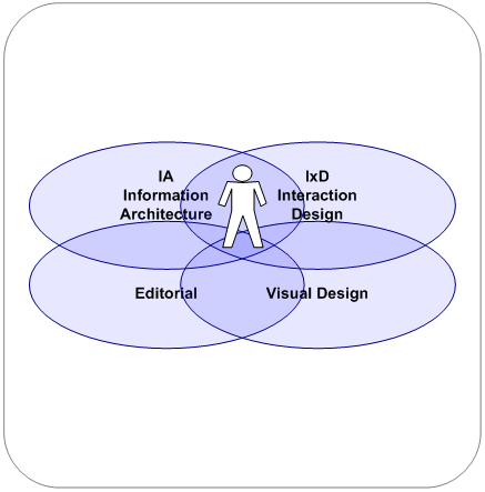
I give a timeline the preference which looks like this:

... to develop a UXdesign and UXplanning.
And in the center of this team and of this process should stand the leading person – the user!
'Designer > UX' 카테고리의 다른 글
| 더 나은 디자이너가 되기 위해 도움이 되는 튜토리얼 사이트 50선 (0) | 2009.04.16 |
|---|---|
| 프리젠테이션 개발자에게 유용한 14가지 Cheat Sheets (0) | 2009.04.04 |
| 2009년 유행할 웹디자인 트렌드 (14) | 2009.01.19 |
| IE8을 미리 대비하기 (0) | 2008.06.13 |
| PhotoshopExpress : 포토샵이 웹으로? (2) | 2008.03.28 |
