CSS3의 구조적인 가상선택자
요즘 front-end 개발자들은 CSS를 "어떻게" 쓰는지에 대해 이해할 필요가 없으나 얼마나 "효과적"으로 쓰는지에 대해서 알 필요가 있습니다. 여기서 "효과적"이라는 것은 프로젝트나 환경에 따라 의미하는것이 다릅니다. 만약 여러명의 웹퍼블리셔들과 함께 작업하고 있거나 id나 class없이 기존 시스템을 작업한다거나, 규모가 큰 웹사이트의 속도를 높이기 위한 최적화작업을 위한 협업을 위해 가장 효과적인 방법이 필요할것입니다.
대부분의 개발자들이 id나 class 선택자에는 친숙하나 조금 더 편안한 작업을 위해 가상선택자(psuedo seletor)에 대해 알아보도록 합니다.
CSS3스펙에는 조금 더 다양한 가상선택자들을 제공하고 있으나 현재 이 글을 작성하고 있는 시점에는 아직 많은 브라우저들이 지원을 하고 있지는 않습니다. 그러나 다양한 자바스크립트 라이브러리나 프레임웍에서 지원하고 있으며 앞으로 브라우저 벤더들도 지원할 예정이니 미리 봐두는것도 좋을 듯 싶습니다.
CSS2 스펙도 현재 진행중인 상태에서 여러분은 이미 CSS2의 선택자를 미리 사용하고 있는 것처럼 브라우저에서 지원하는 CSS3는 지금도 사용할 수 있겠죠..
만약 지원하지 않는 CSS3의 가상선택자를 굳이(?) 사용하고자 하신다면 다음 라이브러리 ( http://selectivizr.com/ )를 사용하시는것도 좋을듯 싶습니다.
 selectivizr-1.0.2.zip
CSS선택자가 뭔지 모르는 분들은 다음글 CSS 선택자 이해하기 글도 한번 참조해 보세요 ^^
가상선택자란
CSS의 가상클래스 혹은 가상선택자 (Pseudo-class)는 id 선택자나 class 선택자와 같이 간단하게 혹은 결합하여 쓸수 없는 요소들을 선택하는 선택자 입니다. 여러분은 마크업 요소의 속성값, 상태, 상대적위치등을 이용하여 각 요소들을 선택할 수 있습니다. 예를 들어 가장 익숙한 가상선택자에는 다음과 같은 것들이 있습니다.
:link
:visited
:hover
:active
:focus
CSS3 스펙에 새롭게 추가된 가상클래스는 DOM Tree상에서의 요소의 위치값, 다른 요소와의 상대적인 위치에 따라 설정되는 "구조적인 선택자"입니다
:root
: only-child
:empty
:nth-child(n)
:nth-last-child(n)
:first-of-type
:last-of-type
: only-of-type
:nth-of-type(n)
:nth-last-of-type(n)
:first-child
:last-child
<참조: CSS Selectors by clearboth>
| Pattern | Meaning | S5 | C8 | F3.6 | O11 | I9b | I8 | I7 | I6 |
|---|---|---|---|---|---|---|---|---|---|
| #id | id로 지정된 요소 선택 | O | O | O | O | O | O | O | O |
| .class | class로 지정된 요소 선택 | O | O | O | O | O | O | O | O |
| E | E 요소를 선택 | O | O | O | O | O | O | O | O |
| E:link | 방문하지 않은 E를 선택 | O | O | O | O | O | O | O | O |
| E:visited | 방문한 E를 선택 | O | O | O | O | O | O | O | O |
| E:hover | 마우스가 올라가 있는 동안 E를 선택 | O | O | O | O | O | O | O | O |
| E:active | 마우스 클릭 또는 키보드(enter)가 눌린 동안 E를 선택 | O | O | O | O | O | O | O | X |
| E:focus | focus가 머물러 있는 동안 E를 선택 | O | O | O | O | O | O | X | X |
| E:first-line | E 요소의 첫 번째 라인 선택 | O | O | O | O | O | O | O | X |
| E:first-letter | E 요소의 첫 번째 문자 선택 | O | O | O | O | O | O | O | X |
| * | 모든 요소 선택 | O | O | O | O | O | O | O | O |
| E[foo] | ‘foo’ 속성이 포함된 E를 선택 | O | O | O | O | O | O | O | X |
| E[foo="bar"] | ‘foo’ 속성의 값이 ’bar’와 일치하는 E를 선택 | O | O | O | O | O | O | O | X |
| E[foo~="bar"] | ‘foo’ 속성의 값에 ’bar’가 포함되는 E를 선택 | O | O | O | O | O | O | O | X |
| E[foo|="en"] | ‘foo’ 속성의 값이 ’en’ 또는 ’en-’ 으로 시작되는 E를 선택 | O | O | O | O | O | O | O | X |
| E:first-child | 첫 번째 자식 요소가 E라면 선택 | O | O | O | O | O | O | O | X |
| E:lang(fr) | HTML lang 속성의 값이 ’fr’로 지정된 E를 선택 | O | O | O | O | O | O | X | X |
| E::before | E 요소 전에 생성된 요소 선택 | O | O | O | O | O | O | X | X |
| E::after | E 요소 후에 생성된 요소 선택 | O | O | O | O | O | O | X | X |
| E>F | E 요소의 자식인 F 요소 선택 | O | O | O | O | O | O | O | X |
| E+F | E 요소를 뒤의 F 요소 선택 | O | O | O | O | O | O | O | X |
| E[foo^="bar"] | ‘foo’ 속성의 값이 ’bar’로 정확하게 시작하는 요소 선택 | O | O | O | O | O | O | O | X |
| E[foo$="bar"] | ‘foo’ 속성의 값이 ’bar’로 정확하게 끝나는 요소 선택 | O | O | O | O | O | O | O | X |
| E[foo*="bar"] | ‘foo’ 속성의 값에 ’bar’를 포함하는 요소 선택 | O | O | O | O | O | O | O | X |
| E:root | 문서의 최상위 루트 요소 선택 | O | O | O | O | O | X | X | X |
| E:nth-child(n) | 그 부모의 n번째 자식이 앞으로부터 지정된 순서와 일치하는 E 라면 선택 | O | O | O | O | O | X | X | X |
| E:nth-last-child(n) | n번째 자식이 뒤로부터 지정된 순서와 일치하는 요소가 E 라면 선택 | O | O | O | O | O | X | X | X |
| E:nth-of-type(n) | E 요소 중 앞으로부터 순서가 일치하는 n번째 E 요소 선택 | O | O | O | O | O | X | X | X |
| E:nth-last-of-type(n) | E 요소 중 끝으로부터 순서가 일치하는 n번째 E 요소 선택 | O | O | O | O | O | X | X | X |
| E:last-child | E 요소 중 마지막 자식이라면 E 선택 | O | O | O | O | O | X | X | X |
| E:first-of-type | E 요소 중 첫번째 E 선택 | O | O | O | O | O | X | X | X |
| E:last-of-type | E 요소 중 마지막 E 선택 | O | O | O | O | O | X | X | X |
| E:only-child | E 요소가 유일한 자식이면 선택 | O | O | O | O | O | X | X | X |
| E:only-of-type | E 요소가 같은 타입이면 선택 | O | O | O | O | O | X | X | X |
| E:empty | 텍스트 및 공백을 포함하여 빈 자식을 가진 E를 선택 | O | O | O | O | O | X | X | X |
| E:target | E의 URI의 대상이 되면 선택 | O | O | O | O | O | X | X | X |
| E:enabled | 활성화된 폼 컨트롤 E요소 선택 | O | O | O | O | O | X | X | X |
| E:disabled | 비활성화된 폼 컨트롤 E요소 선택 | O | O | O | O | O | X | X | X |
| E:checked | 선택된 폼 컨트롤(라디오버튼,체크박스)을 선택 | O | O | O | O | O | X | X | X |
| E:not(s) | s가 아닌 E 요소 선택 | O | O | O | O | O | X | X | X |
| E~F | E 요소가 앞에 존재하면 F를 선택 | O | O | O | O | O | O | O | X |
가상선택자 문법
자세히 알아보기 전에 가상선택자를 사용하기 위한 문법들에 대해서 간단히 알아보도록 합시다
가상선택자는 가상클래스 이름앞에 콜론(:)을 사용합니다.
:pseudo-class {}
만약 특정 요소(SPAN)에 붙이고 싶다면 그 앞에 요소 타입을 적어 주시면 됩니다.
span:pseudo-class {}
또한 id 선택자나 class 선택자에 쓰려면 다음과 같이 작성하면 됩니다.
#id:pseudo-class {}
.class:pseudo-class {}
참~ 쉽죠~잉~
수치값
몇몇 가상선택자는 DOM Tree에서의 특정 위치값을 가진 요소를 선택할 수 있으며, 여러분은 수치값을 해당 요소를 선택할 수 있습니다. 다음과 같이 표현합니다.
:pseudo-class(n) {}
(n)값은 정수형으로 표현되며 선택하고자 하는 요소의 순서입니다. 만약 3번째 값을 선택시에는 다음과 같이 합니다.
:pseudo-class(3) {}
또한 "5번째 요소들 마다" 처럼 공식을 사용할 수 있을때는 다음과 같이 사용합니다.
:pseudo-class(5n) {}
추가적으로 더하기(+), 빼기(-) 값을 이용하여 기준공식을 정할 수 있습니다. 예를 들어 아래와 같이 5n+1 이면 5번째 요소가 첫번째 요소가 된다는 뜻입니다.
:pseudo-class(5n+1) {}
또는 홀수(odd) 짝수(even)와 같이 지정할때는 다음과 같은 표현식이 가능합니다.
:pseudo-class(odd) {}
가상선택자 사용하기
지금까지 가상선택자 사용하기를 간단하게 알아봤고 좀더 상세하게 css3에 추가된 가상클래스에 대해서 알아보도록 합시다.
:root
html의 최상위 대상 요소를 지정하는 것으로 IE hack으로 많이 사용했던 부분이 css3 스펙 표준으로 지정되었습니다.
만약 html 요소와 body요소를 다르게 표현할때 최상위 요소인 html을 백그라운드를 틀리게 표현할때 표현합니다.
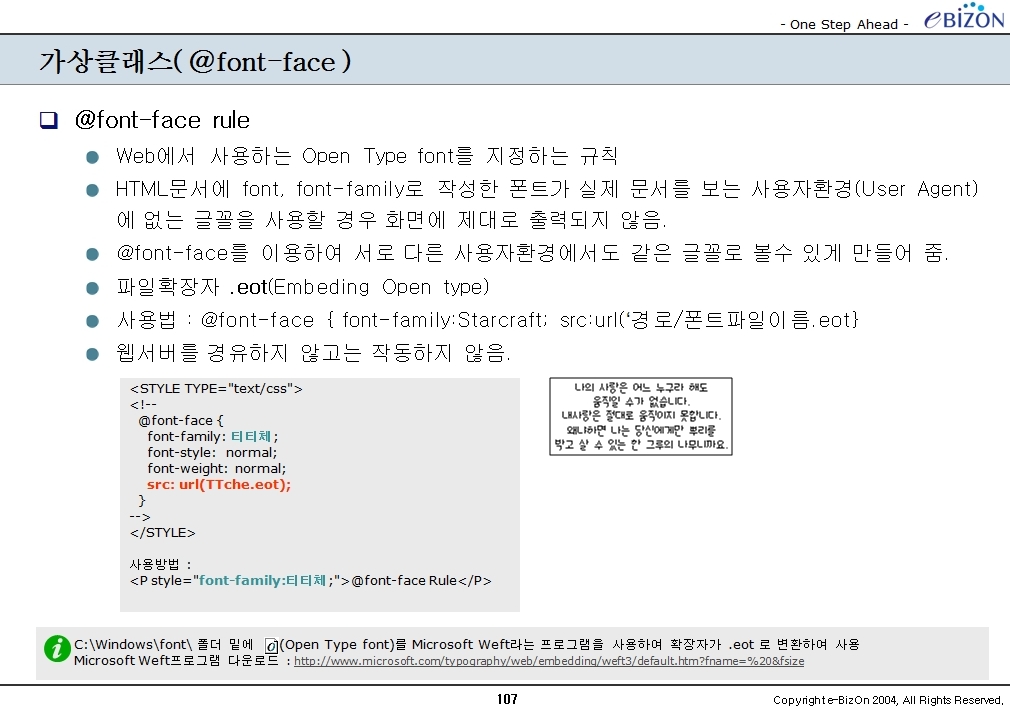
<!DOCTYPE html>
<head>
<title>타이틀</title>
</head>
<body>
</body>
</html>
:root{
background-color: rgb(56,41,48);
}
body {
background-color: rgba(255, 255, 255, .9);
margin: 0 auto;
min-height: 350px;
width: 700px;
}
body부분의 색깔을 달리 표현하고 width값을 700픽셀로 두었을때 최상위인 html 요소부분의 백그라운드 색깔을 바꾸는 소스입니다.
다음과 같이 표현되겠죠..

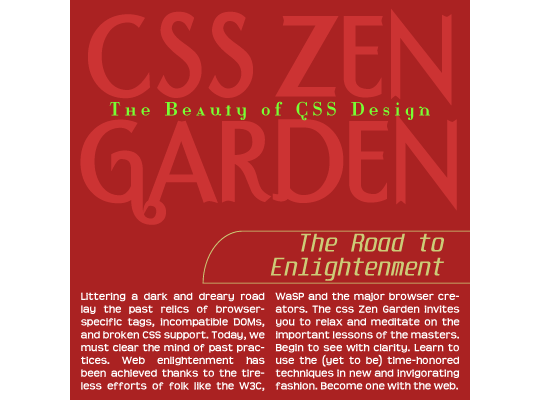
:only-child
부모객체 자식요소중에 유일한 요소에만 스타일을 지정할때 쓰는 요소입니다.
예를 들어 아래와 같이 표현할때

위의 붉은색을 처리할때 다음과 같이 마크업을 합니다.
<h2>
<b>유일한 bold요소</b>
헤딩요소에 들어가는 텍스트입니다.
</h2>
h2 {
background: rgb(255, 255, 255) url(zombies.png) no-repeat 97% 4%;
border: 1px solid rgba(125, 104, 99, .3);
border-radius: 10px;
color: rgb(125,104,99);
font: normal 20px Georgia, "Times New Roman", Times, serif;
padding: 20px 20px 20px 60px; position: relative; width: 450px;
}
b:only-child {
background-color: rgb(156,41,48);
color: rgb(255,255,255);
display: block;
font: bold 12px Arial, Helvetica, sans-serif;
font-weight: bold;
letter-spacing: 1px; padding: 10px;
text-align: center;
text-transform: uppercase;
-moz-transform: translate(-70px) rotate(-5deg) matrix(1, -0.2, 0, 1, 0, 0);
-moz-transform-origin: 50px 0;
-webkit-transform: translate(-70px) rotate(-5deg) matrix(1, -0.2, 0, 1, 0, 0);
-webkit-transform-origin: 50px 0;
-o-transform: translate(-70px) rotate(-5deg) matrix(1, -0.2, 0, 1, 0, 0);
-o-transform-origin: 50px 0;
-ms-transform: translate(-70px) rotate(-5deg) matrix(1, -0.2, 0, 1, 0, 0);
-ms-transform-origin: 50px 0;
transform: translate(-30px) rotate(-5deg) matrix(1, -0.2, 0, 1, 0, 0);
transform-origin: 50px 0 0; width: 150px;
}
:empty
해당 요소의 자식요소로 어떠한 요소나 텍스트요소가 없는 빈 요소를 지정할때 사용됩니다. td의 빈 테이블일때 사용해도 좋겠죠... empty-cells 속성과 같은 용도로 사용할 수 있습니다.
<p></p>
:empty {
background-color: red;
}
td:empty {
background-color: red;
}
위의 td 내용은 아래와 같이 쓸수도 있습니다.
td {
empty-cells: background-color:red;
}
:nth-child(n)
부모객체를 기준으로 상대적으로 자식요소가 n번째 오는 요소를 찾는 방식으로 아래와 같이 댓글을 달때 짝수부분만 처리할때 많이 사용합니다.

<ol>
<li>
<p>2013-01-01</p>
<p><a href="#">T-Dog</a></p>
<p>dog dog dog dog </p>
</li>
<li>
<p>2013-01-01</p>
<p><a href="#">R-Cat</a></p>
<p>cat cat cat cat </p>
</li>
<li>
<p>2013-01-01</p>
<p><a href="#">S-Pig</a></p>
<p>pig pig pig pig </p>
</li>
</ol>
일반 적으로 위 마크업에서 li 부분만 CSS를 입힌다면 다음과 같이 CSS를 작성합니다.
li {
background-color: rgba(194, 181, 158, .5);
background-image: -webkit-gradient(linear, left top, left bottom, from(rgba(194, 181, 158, .7))
, to(rgba(194, 181, 158, 0)));
background-image: -moz-linear-gradient(top, rgba(194, 181, 158, .7), rgba(194, 181, 158, 0));
background-image: -o-linear-gradient( rgba(194, 181, 158, .7), rgba(194, 181, 158, 0));
border: 1px solid rgb(194, 181, 158);
border-radius: 10px;
margin: 15px 0;
padding: 25px;
}
그러면 동일하게 li 부분의 스타일이 적용되지만 li 중에 짝수(even)에 해당하는 줄을 넣고자 한다면 아래와 같이 CSS를 더 추가해 줍니다.
li:nth-child(even){
background-color: rgba(242, 224, 131, .5);
background-image: -webkit-gradient(linear, left top, left bottom, from(rgba(242, 224, 131, .7))
, to(rgba(242, 224, 131, 0)));
background-image: -moz-linear-gradient(top, rgba(242, 224, 131, .7), rgba(242, 224, 131, 0));
background-image: -o-linear-gradient( rgba(242, 224, 131, .7), rgba(242,224, 131, 0));
border: 1px solid rgb(242, 224, 131);
}
:nth-last-child(n)
위의 :nth-child(n)과 마찬가지로 상대적인 순서가 뒤에서 부터 n 번째 인 요소를 찾을때 사용됩니다.
위의 마크업중 li 태그의 자식요소로 여러개의 p 요소가 들어가는데 뒤에서 2번째 p 요소에 스타일을 적용시킬때는 다음과 같이 스타일을 적용합니다.
p:nth-last-child(2) {
clear: left;
float: left;
font-size: 12px;
margin-top: 5px;
text-align: center;
width: 80px;
}
그럼 아래와 같이 두번째 p 요소에 float:left 속성이 적용되어 다음 p 요소가 위로 와서 붙겠죠...

:first-of-type
부모요소 안에서 특정한 타입요소(태그) 중 첫번째 요소를 선택하는 가상선택자로 사용됩니다. 위 샘플중 리스트 목록요소의 첫번째 p 태그(타입요소)에 대해서만 스타일을 적용한다면 다음과 같습니다.
p:first-of-type {
border-bottom: 1px solid rgba(56,41,48, .5);
float: right;
font-weight: bold;
padding-bottom: 3px;
text-align: right;
width: 560px;
}

:last-of-type
:first-of-type과 마찬가지로 같은 부모요소안의 가장 마지막 타입요소를 선택하는 가상선택자 입니다.
p:last-of-type {
font-style: italic;
margin: 50px 10px 10px 100px;
}
:only-of-type
하나의 같은 부모요소안에 단 하나의 타입요소를 선택하는 가상선택자로 반드시 부모객체에 해당 태그(타입요소)가 하나만 존재해야 합니다.
<li>
<p>2013-01-01</p>
<p><a href="#"><img src="pig.jpg" alt="pig" /></a></p>
<p>pig pig pig pig </p>
</li>
img:only-of-type{
background-color: rgb(255, 255,255);
border: 1px solid rgba(56,41,48, .5);
float: left;
padding: 3px;
}
:nth-of-type(n)
같은 부모 밑에 상대적인 순서로 n 번째 오는 타입요소를 선택합니다.
:nth-last-of-type(n)
:first-child
:last-child
Reference site
- webappers.com : http://www.webappers.com/2013/03/12/css3-selectors-structural-pseudo-classes-part-1/
- CSS3를 이용한 토글스위치만들기 : 요기
- CSS 선택자의 종류 : http://www.clearboth.org/css3_1_by_isdn386/
- O11 – Opera 11
- Selector – W3C
- F3.6 – Mozilla FireFox 3.6.x
'Publisher > CSS' 카테고리의 다른 글
| 보석같은 CSS3 함수 calc() (3) | 2013.03.11 |
|---|---|
| Height 100% 2~3단 컨텐츠 레이아웃잡기 (18) | 2010.07.27 |
| 간단한 CSS Reset (4) | 2010.05.24 |
| CSS 최적화 기법 (7) | 2010.03.08 |
| 지금 바로 쓸수 있는 CSS3 (0) | 2010.03.07 |


 test.html


 test.rar